Plotting#
Plot contains many plot functions that can be used to
visualize pyfar audio objects in the
time and frequency domain for inspecting data and generating scientific plots.
The plots are based on Matplotlib and all plot functions return Matplotlib axis objects for a flexible customization of plots. In addition most plot functions pass keyword arguments (kwargs) to Matplotlib.
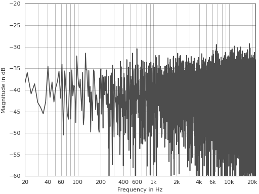
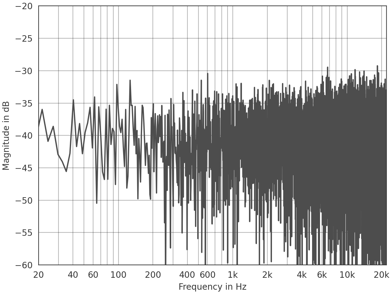
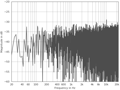
This is an example for customizing the line color using a keyword argument and the axis limits using the Matplotlib axis object:
>>> import pyfar as pf
>>> noise = pf.signals.noise(2**14)
>>> ax = pf.plot.freq(noise, color=(.3, .3, .3))
>>> ax.set_ylim(-60, -20)
(Source code, png, hires.png, pdf)
Plot styles#
Pyfar contains a light and dark plot style and applies the light plot
style by default in its plot functions. If you want to
apply the style to code outside these functions you can use
pyfar.plot.use()
to overwrite the currently used plot style or
with pyfar.plot.context():
    # everything inside the with statement
    # uses the pyfar plot style
If you do not want to use the pyfar plot style, you can pass an empty dictionary to the plot functions
pyfar.plot.time(signal, style={})
This can also be used to overwrite specific parameters of the pyfar plot styles
pyfar.plot.time(signal, style={axes.facecolor='black'})
Interactive plots#
It is often helpful to quickly navigate through the channels of multi-channel
data or zoom into the plot around a specific frequency or amplitude. This can
be done with the pyfar keyboard shortcuts and
requires an interactive backend
like QtAgg.
Use these shortcuts to toggle between plots
Key |
Plot |
|---|---|
1, shift+t |
|
2, shift+f |
|
3, shift+p |
|
4, shift+g |
|
5, shift+s |
|
6, ctrl+shift+t, ctrl+shift+f |
|
7, ctrl+shift+p |
|
8, ctrl+shift+g |
Note that not all plots are available for TimeData and FrequencyData objects as detailed in the plot module documentation.
Use these shortcuts to control the plot
Key |
Action |
|---|---|
left |
move x-axis view to the left |
right |
move x-axis view to the right |
up |
move y-axis view upwards |
down |
y-axis view downwards |
+, ctrl+shift+up |
move colormap range up |
-, ctrl+shift+down |
move colormap range down |
shift+right |
zoom in x-axis |
shift+left |
zoom out x-axis |
shift+up |
zoom out y-axis |
shift+down |
zoom in y-axis |
shift+plus, alt+shift+up |
zoom colormap range in |
shift+minus, alt+shift+down |
zoom colormap range out |
shift+x |
toggle between linear and logarithmic x-axis |
shift+y |
toggle between linear and logarithmic y-axis |
shift+c |
toggle between linear and logarithmic color data |
shift+a |
toggle between plotting all channels and plotting single channels |
< |
cycle between line and 2D plots |
> |
toggle between vertical and horizontal orientation of 2D plots |
., ] |
show next channel |
,, [ |
show previous channel |
Notes on plot controls
Moving and zooming the x and y axes is supported by all plots.
Moving and zooming the colormap is only supported by plots that have a colormap.
Toggling the x-axis is supported by:
time,freq,phase,group_delay,spectrogram,time_freq,freq_phase,freq_group_delayToggling the y-axis is supported by:
time,freq,phase,group_delay,spectrogram,time_freq,freq_phase,freq_group_delayToggling the colormap is supported by:
spectrogramToggling between line and 2D plots is not supported by: spectrogram