Plotting
Plot contains many plot functions that can be used to
visualize pyfar audio objects in the
time and frequency domain for inspecting data and generating scientific plots.
The plots are based on Matplotlib and all plot functions return Matplotlib axis objects for a flexible customization of plots. In addition most plot functions pass keyword arguments (kwargs) to Matplotlib.
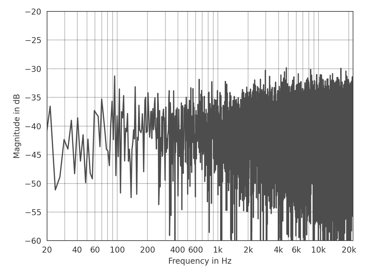
This is an example for customizing the line color using a keyword argument and the axis limits using the Matplotlib axis object:
>>> import pyfar as pf
>>> noise = pf.signals.noise(2**14)
>>> ax = pf.plot.freq(noise, color=(.3, .3, .3))
>>> ax.set_ylim(-60, -20)
(Source code, png, hires.png, pdf)

Interactive plots
It is often helpful to quickly navigate through the channels of multi-channel
data or zoom into the plot around a specific frequency or amplitude. This can
be done with the pyfar keyboard shortcuts and
requires an interactive backend
like QtAgg.