pyfar.plot
Plot pyfar audio objects in the time and frequency domain for quickly inspecting audio data and generating scientific plots.
Keyboard shortcuts are available for to ease the inspection
(See pyfar.plot.shortcuts).
pyfar.plot is based on Matplotlib and
all plot functions return Matplotlib axis objects for a flexible customization
of plots. In addition most plot functions pass keyword arguments to Matplotlib.
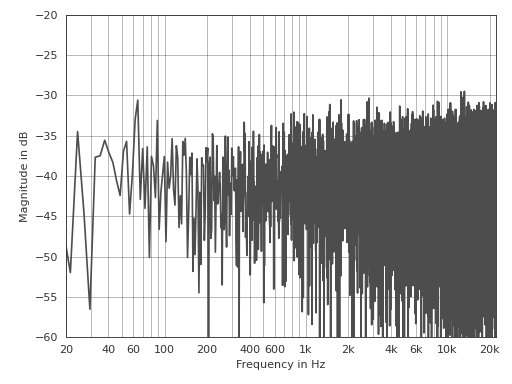
This is an example for customizing the line color and axis limits:
>>> import pyfar as pf
>>> noise = pf.signals.noise(2**14)
>>> ax = pf.plot.freq(noise, color=(.3, .3, .3))
>>> ax.set_ylim(-60, -20)
(Source code, png, hires.png, pdf)

Functions:
|
Return pyfar default color as HEX string. |
|
Context manager for using plot styles temporarily. |
|
Plot multiple pyfar plots with a custom layout and default parameters. |
|
Plot the magnitude spectrum. |
|
Plot the magnitude and group delay spectrum in a 2 by 1 subplot layout. |
|
Plot the magnitude and phase spectrum in a 2 by 1 subplot layout. |
|
Plot the group delay. |
|
Plot the phase of the spectrum. |
|
Get the fullpath of the pyfar plotstyles |
|
Show and return keyboard shortcuts for interactive figures. |
|
Plot blocks of the magnitude spectrum versus time. |
|
Plot the time signal. |
|
Plot the time signal and magnitude spectrum in a 2 by 1 subplot layout. |
|
Use plot style settings from a style specification. |
- pyfar.plot.color(color: str)[source]
Return pyfar default color as HEX string.
- Parameters
color (str) – Available colors are purple ,blue, turquoise, green, light green, yellow, orange, and red. The colors can be specified by their full name, e.g.,
redor the first letter, e.g.,r.- Returns
color – pyfar default color as HEX string
- Return type
str
- pyfar.plot.context(style='light', after_reset=False)[source]
Context manager for using plot styles temporarily.
This context manager supports the two pyfar styles
lightanddark. It is a wrapper formatplotlib.pyplot.style.context().- Parameters
style (str, dict, Path or list) –
A style specification. Valid options are:
str
The name of a style or a path/URL to a style file. For a list of available style names, see
matplotlib.style.available.dict
Dictionary with valid key/value pairs for
matplotlib.rcParams.Path
A path-like object which is a path to a style file.
list
A list of style specifiers (str, Path or dict) applied from first to last in the list.
after_reset (bool) – If
True, apply style after resetting settings to their defaults; otherwise, apply style on top of the current settings.
See also
Examples
Generate customizable subplots with the default pyfar plot style
>>> import pyfar as pf
>>> import matplotlib.pyplot as plt
>>> with pf.plot.context():
>>>     fig, ax = plt.subplots(2, 1)
>>>     pf.plot.time(pf.Signal([0, 1, 0, -1], 44100), ax=ax[0])
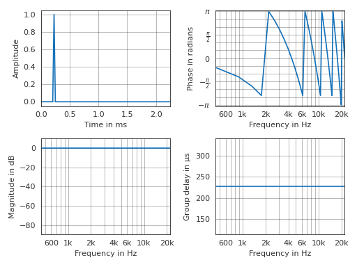
- pyfar.plot.custom_subplots(signal, plots, ax=None, style='light', **kwargs)[source]
Plot multiple pyfar plots with a custom layout and default parameters.
The plots are passed as a list of
pyfar.plotfunction handles. The subplot layout is taken from the shape of that list (see example below).- Parameters
signal (Signal) – The input data to be plotted.
plots (list, nested list) – Function handles for plotting.
ax (matplotlib.pyplot.axes) – Axes to plot on. The default is
None, which uses the current axis or creates a new figure if none exists.style (str) –
lightordarkto use the pyfar plot styles or a plot style frommatplotlib.style.available. The default islight.**kwargs – Keyword arguments that are passed to
matplotlib.pyplot.plot().
- Returns
ax – List of axes handles
- Return type
matplotlib.pyplot.axes
Examples
Generate a two by two subplot layout
>>> import pyfar as pf
>>> impulse = pf.signals.impulse(100, 10)
>>> plots = [[pf.plot.time, pf.plot.phase],
...          [pf.plot.freq, pf.plot.group_delay]]
>>> pf.plot.custom_subplots(impulse, plots)
(Source code, png, hires.png, pdf)
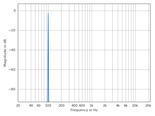
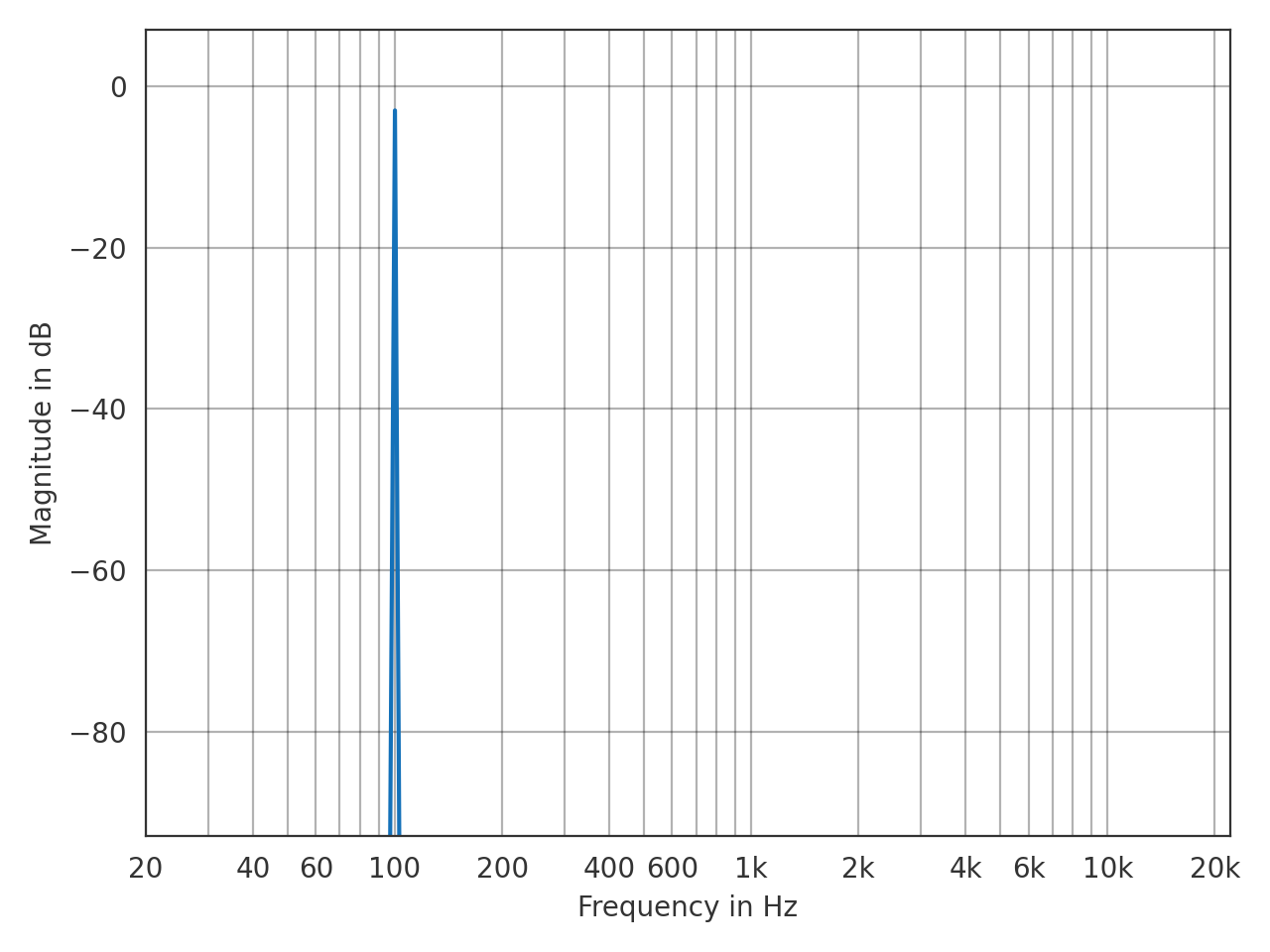
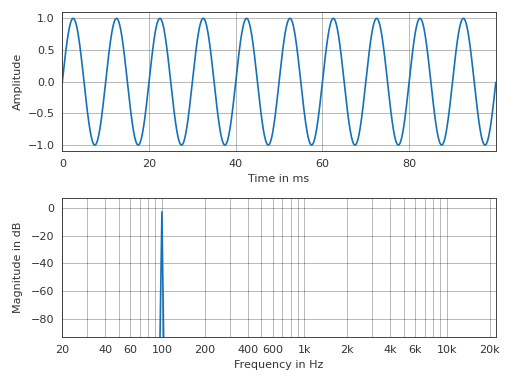
- pyfar.plot.freq(signal, dB=True, log_prefix=20, log_reference=1, xscale='log', ax=None, style='light', **kwargs)[source]
Plot the magnitude spectrum.
Plots
abs(signal.freq)and passes keyword arguments (kwargs) tomatplotlib.pyplot.plot().- Parameters
signal (Signal, FrequencyData) – The input data to be plotted.
dB (bool) – Indicate if the data should be plotted in dB in which case
log_prefix * np.log10(abs(signal.freq) / log_reference)is used. The default isTrue.log_prefix (integer, float) – Prefix for calculating the logarithmic frequency data. The default is
20.log_reference (integer, float) – Reference for calculating the logarithmic frequency data. The default is
1.xscale (str) –
linearorlogto plot on a linear or logarithmic frequency axis. The default islog.ax (matplotlib.pyplot.axes) – Axes to plot on. The default is
None, which uses the current axis or creates a new figure if none exists.style (str) –
lightordarkto use the pyfar plot styles or a plot style frommatplotlib.style.available. The default islight.**kwargs – Keyword arguments that are passed to
matplotlib.pyplot.plot().
- Returns
ax – Axes or array of axes containing the plot.
- Return type
matplotlib.pyplot.axes
Example
>>> import pyfar as pf
>>> sine = pf.signals.sine(100, 4410)
>>> pf.plot.freq(sine)
(Source code, png, hires.png, pdf)

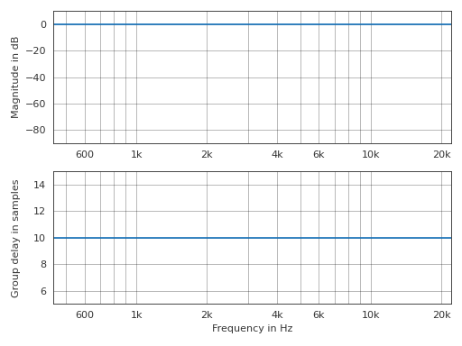
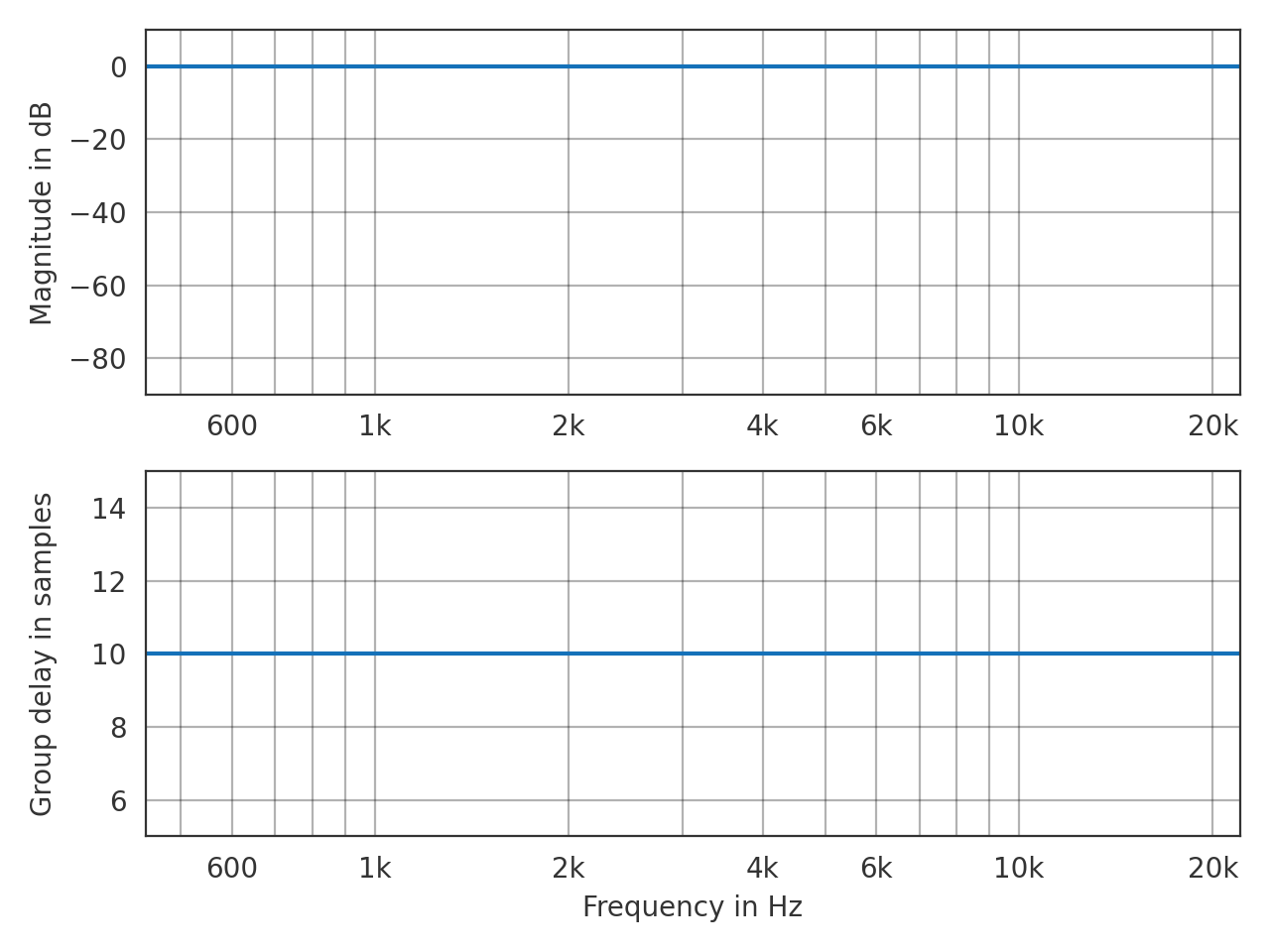
- pyfar.plot.freq_group_delay(signal, dB=True, log_prefix=20, log_reference=1, unit=None, xscale='log', ax=None, style='light', **kwargs)[source]
Plot the magnitude and group delay spectrum in a 2 by 1 subplot layout.
Passes keyword arguments (kwargs) to
matplotlib.pyplot.plot().- Parameters
signal (Signal, FrequencyData) – The input data to be plotted.
dB (bool) – Flag to plot the logarithmic magnitude spectrum. The default is
True.log_prefix (integer, float) – Prefix for calculating the logarithmic frequency data. The default is
20.log_reference (integer) – Reference for calculating the logarithmic frequency data. The default is
1.unit (str) – Unit of the group delay. Can be
s,ms,mus, orsamples. The default isNone, which sets the unit tos(seconds),ms(milli seconds), ormus(micro seconds) depending on the data.xscale (str) –
linearorlogto plot on a linear or logarithmic frequency axis. The default islog.ax (matplotlib.pyplot.axes) – Axes to plot on. The default is
None, which uses the current axis or creates a new figure if none exists.style (str) –
lightordarkto use the pyfar plot styles or a plot style frommatplotlib.style.available. The default islight.**kwargs – Keyword arguments that are passed to
matplotlib.pyplot.plot().
- Returns
ax – Axes or array of axes containing the plot.
- Return type
matplotlib.pyplot.axes
Examples
>>> import pyfar as pf
>>> impulse = pf.signals.impulse(100, 10)
>>> pf.plot.freq_group_delay(impulse, unit='samples')
(Source code, png, hires.png, pdf)
- pyfar.plot.freq_phase(signal, dB=True, log_prefix=20, log_reference=1, xscale='log', deg=False, unwrap=False, ax=None, style='light', **kwargs)[source]
Plot the magnitude and phase spectrum in a 2 by 1 subplot layout.
- Parameters
signal (Signal, FrequencyData) – The input data to be plotted.
dB (bool) – Indicate if the data should be plotted in dB in which case
log_prefix * np.log10(abs(signal.freq) / log_reference)is used. The default isTrue.log_prefix (integer, float) – Prefix for calculating the logarithmic frequency data. The default is
20.log_reference (integer) – Reference for calculating the logarithmic frequency data. The default is
1.deg (bool) – Flag to plot the phase in degrees. The default is
False.unwrap (bool, str) – True to unwrap the phase or “360” to unwrap the phase to 2 pi. The default is
False.xscale (str) –
linearorlogto plot on a linear or logarithmic frequency axis. The default islog.ax (matplotlib.pyplot.axes) – Axes to plot on. The default is
None, which uses the current figure ore creates a new one if no figure exists.style (str) –
lightordarkto use the pyfar plot styles or style frommatplotlib.style.available. The default islight.**kwargs – Keyword arguments that are forwarded to matplotlib.pyplot.plot
- Returns
ax – Axes or array of axes containing the plot.
- Return type
matplotlib.pyplot.axes
See also
matplotlib.pyplot.plot
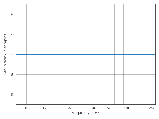
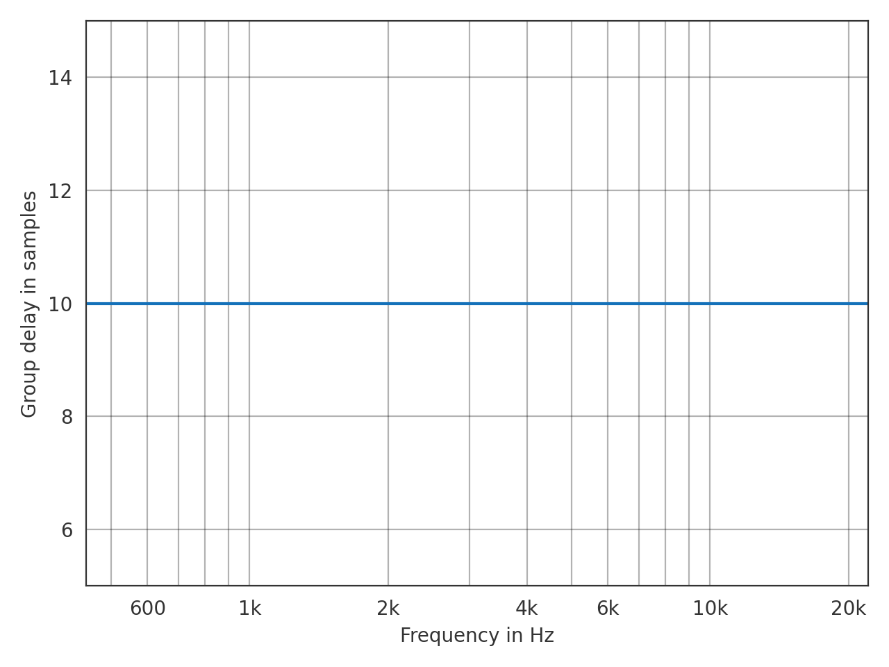
- pyfar.plot.group_delay(signal, unit=None, xscale='log', ax=None, style='light', **kwargs)[source]
Plot the group delay.
Passes keyword arguments (kwargs) to
matplotlib.pyplot.plot().- Parameters
signal (Signal) – The input data to be plotted.
unit (str, None) – Unit of the group delay. Can be
s,ms,mus, orsamples. The default isNone, which sets the unit tos(seconds),ms(milli seconds), ormus(micro seconds) depending on the data.xscale (str) –
linearorlogto plot on a linear or logarithmic frequency axis. The default islog.ax (matplotlib.pyplot.axes) – Axes to plot on. The default is
None, which uses the current axis or creates a new figure if none exists.style (str) –
lightordarkto use the pyfar plot styles or a plot style frommatplotlib.style.available. The default islight.**kwargs – Keyword arguments that are passed to
matplotlib.pyplot.plot().
- Returns
ax – Axes or array of axes containing the plot.
- Return type
matplotlib.pyplot.axes
Examples
>>> import pyfar as pf
>>> impulse = pf.signals.impulse(100, 10)
>>> pf.plot.group_delay(impulse, unit='samples')
(Source code, png, hires.png, pdf)
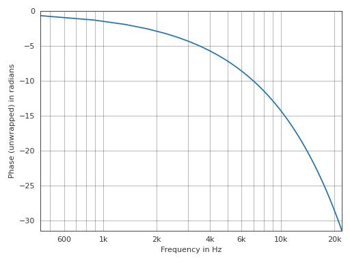
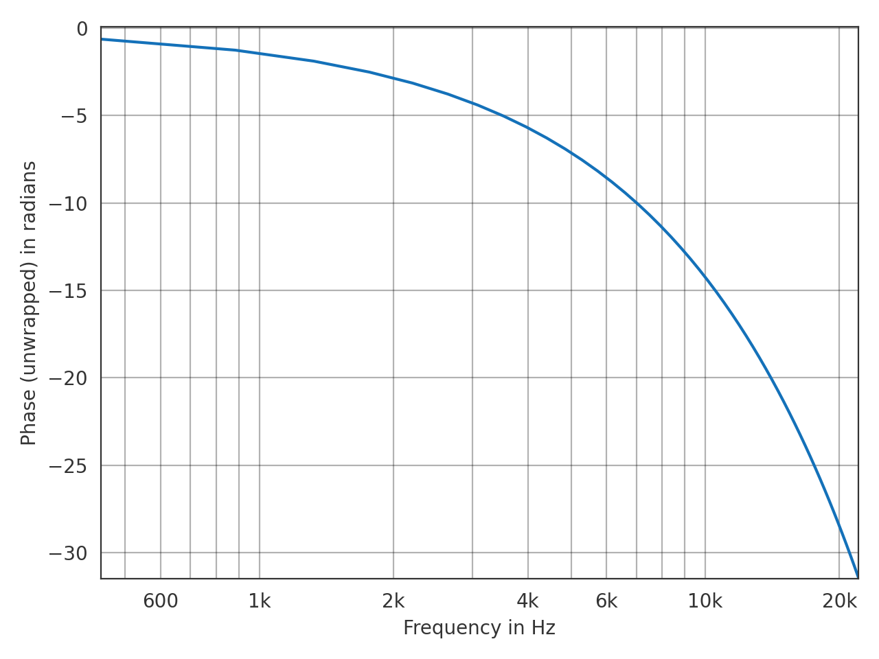
- pyfar.plot.phase(signal, deg=False, unwrap=False, xscale='log', ax=None, style='light', **kwargs)[source]
Plot the phase of the spectrum.
Plots
angle(signal.freq)and passes keyword arguments (kwargs) tomatplotlib.pyplot.plot().- Parameters
signal (Signal, FrequencyData) – The input data to be plotted.
deg (bool) – Plot the phase in degrees. The default is
False, which plots the phase in radians.unwrap (bool, str) – True to unwrap the phase or “360” to unwrap the phase to 2 pi. The default is
False, which plots the wrapped phase.xscale (str) –
linearorlogto plot on a linear or logarithmic frequency axis. The default islog.ax (matplotlib.pyplot.axes object) – Axes to plot on. The default is
None, which uses the current axis or creates a new figure if none exists.style (str) –
lightordarkto use the pyfar plot styles or a plot style frommatplotlib.style.available. The default islight.**kwargs – Keyword arguments that are passed to
matplotlib.pyplot.plot().
- Returns
ax – Axes or array of axes containing the plot.
- Return type
matplotlib.pyplot.axes
Example
>>> import pyfar as pf
>>> impulse = pf.signals.impulse(100, 10)
>>> pf.plot.phase(impulse, unwrap=True)
(Source code, png, hires.png, pdf)

- pyfar.plot.plotstyle(style='light')[source]
Get the fullpath of the pyfar plotstyles
lightordark.The plotstyles are defined by mplstyle files, which is Matplotlibs format to define styles. By default, pyfar uses the
lightplotstyle.- Parameters
style (str) –
light, ordark- Returns
style – Full path to the pyfar plotstyle.
- Return type
str
See also
- pyfar.plot.shortcuts(show=True)[source]
Show and return keyboard shortcuts for interactive figures.
Note that shortcuts are only available if using an interactive backend in Matplotlib, e.g., by
%matplotlib qt.- Parameters
show (bool, optional) – print the keyboard shortcuts to the default console. The default is
True.- Returns
short_cuts – dictionary that contains all the shortcuts
- Return type
dict
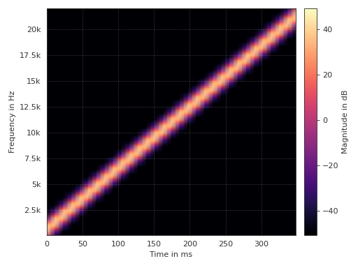
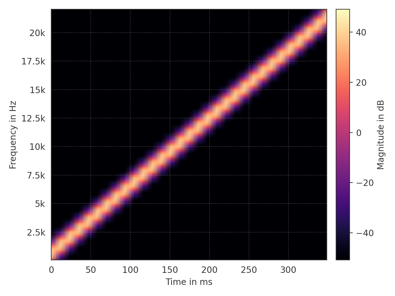
- pyfar.plot.spectrogram(signal, dB=True, log_prefix=20, log_reference=1, yscale='linear', unit=None, window='hann', window_length=1024, window_overlap_fct=0.5, cmap=<matplotlib.colors.ListedColormap object>, ax=None, style='light')[source]
Plot blocks of the magnitude spectrum versus time.
- Parameters
signal (Signal) – The input data to be plotted.
dB (bool) – Indicate if the data should be plotted in dB in which case
log_prefix * np.log10(abs(signal.freq) / log_reference)is used. The default isTrue.log_prefix (integer, float) – Prefix for calculating the logarithmic frequency data. The default is
20.log_reference (integer) – Reference for calculating the logarithmic frequency data. The default is
1.yscale (str) –
linearorlogto plot on a linear or logarithmic frequency axis. The default islinear.unit (str, None) – Unit of the time axis. Can be
s,ms,mus, orsamples. The default isNone, which sets the unit tos(seconds),ms(milli seconds), ormus(micro seconds) depending on the data.window (str) – Specifies the window that is applied to each block of the time data before applying the Fourier transform. The default is
hann. Seescipy.signal.get_windowfor a list of possible windows.window_length (integer) – Specifies the window/block length in samples. The default is
1024.window_overlap_fct (double) – Ratio of points to overlap between blocks [0…1]. The default is
0.5, which would result in 512 samples overlap for a window length of 1024 samples.cmap (matplotlib.colors.Colormap(name, N=256)) – Colormap for spectrogram. Defaults to matplotlibs
magmacolormap.ax (matplotlib.pyplot.axes) – Axes to plot on. The default is
None, which uses the current axis or creates a new figure if none exists.style (str) –
lightordarkto use the pyfar plot styles or a plot style frommatplotlib.style.available. The default islight.
- Returns
ax – Axes or array of axes containing the plot.
- Return type
matplotlib.pyplot.axes
Example
>>> import pyfar as pf
>>> sweep = pf.signals.linear_sweep(2**14, [0, 22050])
>>> pf.plot.spectrogram(sweep)
(Source code, png, hires.png, pdf)
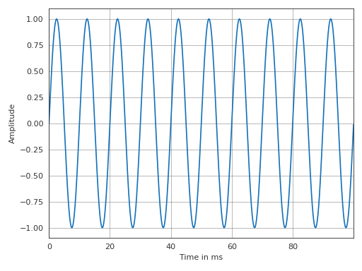
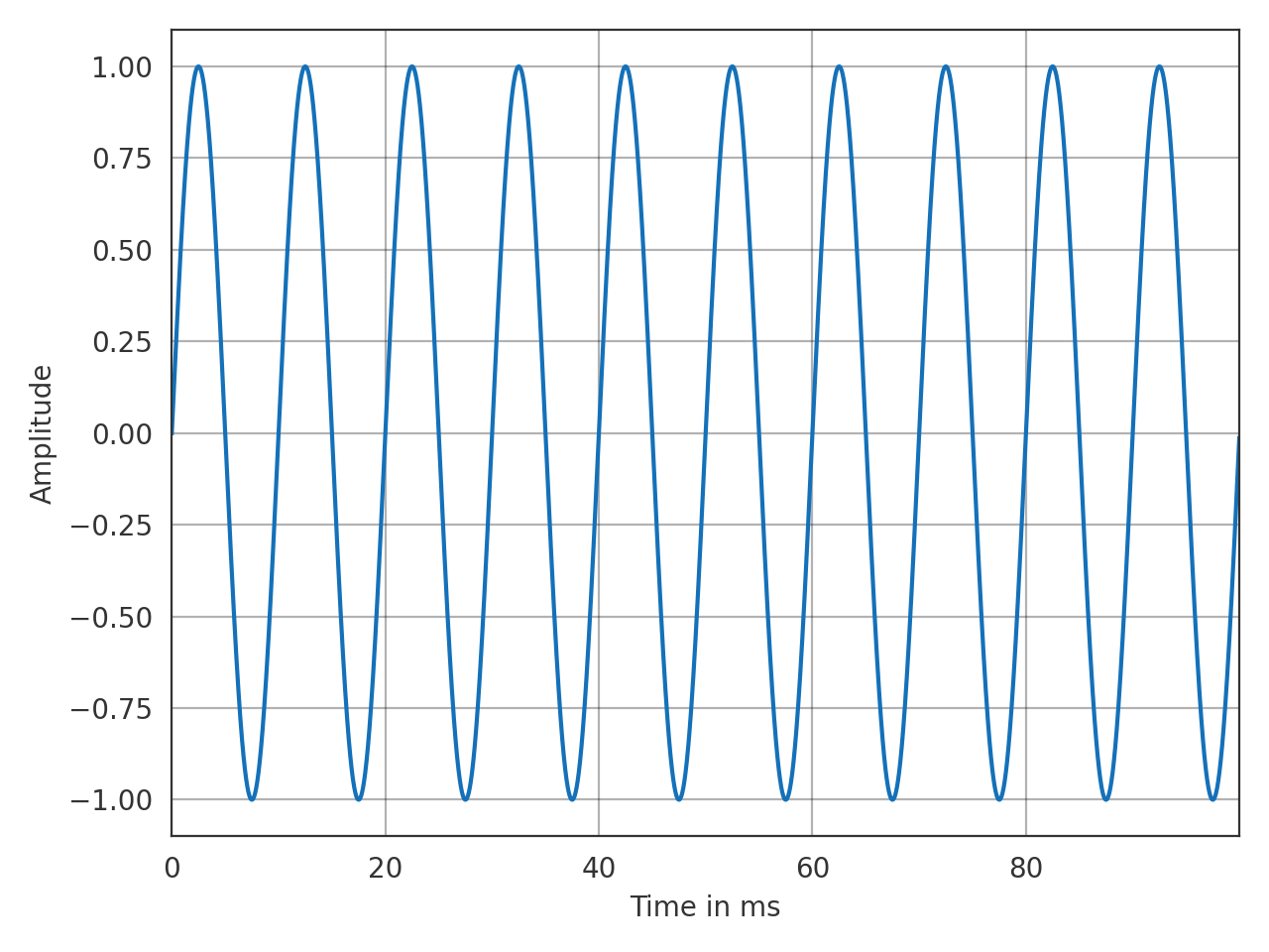
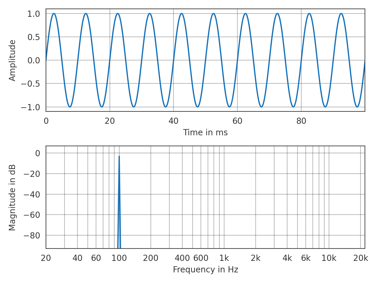
- pyfar.plot.time(signal, dB=False, log_prefix=20, log_reference=1, unit=None, ax=None, style='light', **kwargs)[source]
Plot the time signal.
Plots
signal.timeand passes keyword arguments (kwargs) tomatplotlib.pyplot.plot().- Parameters
dB (bool) – Indicate if the data should be plotted in dB in which case
log_prefix * np.log10(signal.time / log_reference)is used. The default isFalse.log_prefix (integer, float) – Prefix for calculating the logarithmic time data. The default is
20.log_reference (integer) – Reference for calculating the logarithmic time data. The default is
1.unit (str, None) – Unit of the time axis. Can be
s,ms,mus, orsamples. The default isNone, which sets the unit tos(seconds),ms(milli seconds), ormus(micro seconds) depending on the data.ax (matplotlib.pyplot.axes) – Axes to plot on. The default is
None, which uses the current axis or creates a new figure if none exists.style (str) –
lightordarkto use the pyfar plot styles or a plot style frommatplotlib.style.available. The default islight.**kwargs – Keyword arguments that are passed to
matplotlib.pyplot.plot().
- Returns
ax – Axes or array of axes containing the plot.
- Return type
matplotlib.pyplot.axes
Examples
>>> import pyfar as pf
>>> sine = pf.signals.sine(100, 4410)
>>> pf.plot.time(sine)
(Source code, png, hires.png, pdf)

- pyfar.plot.time_freq(signal, dB_time=False, dB_freq=True, log_prefix=20, log_reference=1, xscale='log', unit=None, ax=None, style='light', **kwargs)[source]
Plot the time signal and magnitude spectrum in a 2 by 1 subplot layout.
- Parameters
signal (Signal) – The input data to be plotted.
dB_time (bool) – Indicate if the data should be plotted in dB in which case
log_prefix * np.log10(signal.time / log_reference)is used. The default isFalse.dB_freq (bool) – Indicate if the data should be plotted in dB in which case
log_prefix * np.log10(abs(signal.freq) / log_reference)is used. The default isTrue.log_prefix (integer, float) – Prefix for calculating the logarithmic time/frequency data. The default is
20.log_reference (integer) – Reference for calculating the logarithmic time/frequency data. The default is
1.xscale (str) –
linearorlogto plot on a linear or logarithmic frequency axis. The default islog.unit (str) – Unit of the time axis. Can be
s,ms,mus, orsamples. The default isNone, which sets the unit tos(seconds),ms(milli seconds), ormus(micro seconds) depending on the data.ax (matplotlib.pyplot.axes) – Axes to plot on. The default is
None, which uses the current axis or creates a new figure if none exists.style (str) –
lightordarkto use the pyfar plot styles or a plot style frommatplotlib.style.available. The default islight.**kwargs – Keyword arguments that are passed to
matplotlib.pyplot.plot().
- Returns
ax – Axes or array of axes containing the plot.
- Return type
matplotlib.pyplot.axes
Examples
>>> import pyfar as pf
>>> sine = pf.signals.sine(100, 4410)
>>> pf.plot.time_freq(sine)
(Source code, png, hires.png, pdf)
- pyfar.plot.use(style='light')[source]
Use plot style settings from a style specification.
The style name of
defaultis reserved for reverting back to the default style settings. This is a wrapper formatplotlib.style.usethat supports the pyfar plot styleslightanddark.- Parameters
style (str, dict, Path or list) –
A style specification. Valid options are:
str
The name of a style or a path/URL to a style file. For a list of available style names, see
matplotlib.style.available.dict
Dictionary with valid key/value pairs for
matplotlib.rcParams.Path
A path-like object which is a path to a style file.
list
A list of style specifiers (str, Path or dict) applied from first to last in the list.
See also
Notes
This updates the rcParams with the settings from the style. rcParams not defined in the style are kept.
Examples
Permanently use the pyfar default plot style
>>> import pyfar as pf
>>> import matplotlib.pyplot as plt
>>> pf.plot.utils.use()
>>> fig, ax = plt.subplots(2, 1)
>>> pf.plot.time(pf.Signal([0, 1, 0, -1], 44100), ax=ax[0])