
pyfar.plot#
The following documents the pyfar plot functions. Make sure to have a look at
the
plotting and
interactive plotting
examples. The latter make use of the pyfar
shortcuts to quickly explore acoustic signals.
Functions:
|
Return pyfar default color as HEX string. |
|
Context manager for using plot styles temporarily. |
|
Plot multiple pyfar plots with a custom layout and default parameters. |
|
Plot the magnitude spectrum. |
|
2D color coded plot of magnitude spectra. |
|
Plot the magnitude and group delay spectrum (2 by 1 subplot). |
|
2D color coded plot of magnitude spectra and group delay (2 by 1 subplot). |
|
Plot the magnitude and phase spectrum (2 by 1 subplot). |
|
2D color coded plot of magnitude and phase spectra (2 by 1 subplot). |
|
Plot the group delay. |
|
2D color coded plot of the group delay. |
|
Plot the phase of the spectrum. |
|
2D color coded plot of phase spectra. |
|
Get the fullpath of the pyfar plotstyles |
|
Show and return keyboard shortcuts for interactive figures. |
|
Plot blocks of the magnitude spectrum versus time. |
|
Plot the time signal. |
|
2D color coded plot of time signals. |
|
Plot the time signal and magnitude spectrum (2 by 1 subplot). |
|
2D color coded plot of time signals and magnitude spectra (2 by 1 subplot). |
|
Use plot style settings from a style specification. |
- pyfar.plot.color(color)[source]#
Return pyfar default color as HEX string.
- Parameters:
color (int, str) –
The colors can be specified by their index, their full name, or the first letter. Available colors are:
1
'b'blue
2
'r'red
3
'y'yellow
4
'p'purple
5
'g'green
6
't'turquois
7
'o'orange
8
'l'light green
- Returns:
color_hex – pyfar default color as HEX string
- Return type:
str
- pyfar.plot.context(style='light', after_reset=False)[source]#
Context manager for using plot styles temporarily.
This context manager supports the two pyfar styles
lightanddark. It is a wrapper formatplotlib.style.context.- Parameters:
style (str, dict, Path or list) –
A style specification. Valid options are:
str
The name of a style or a path/URL to a style file. For a list of available style names, see
matplotlib.style.available.dict
Dictionary with valid key/value pairs for
matplotlib.rcParams.Path
A path-like object which is a path to a style file.
list
A list of style specifiers (str, Path or dict) applied from first to last in the list.
after_reset (bool) – If
True, apply style after resetting settings to their defaults; otherwise, apply style on top of the current settings.
See also
Examples
Generate customizable subplots with the default pyfar plot style
>>> import pyfar as pf
>>> import matplotlib.pyplot as plt
>>> with pf.plot.context():
>>>     fig, ax = plt.subplots(2, 1)
>>>     pf.plot.time(pf.Signal([0, 1, 0, -1], 44100), ax=ax[0])
- pyfar.plot.custom_subplots(signal, plots, ax=None, style='light', **kwargs)[source]#
Plot multiple pyfar plots with a custom layout and default parameters.
The plots are passed as a list of
pyfar.plotfunction handles. The subplot layout is taken from the shape of that list (see example below).- Parameters:
signal (Signal) – The input data to be plotted. Multidimensional data are flattened for plotting, e.g, a signal of
signal.cshape = (2, 2)would be plotted in the order(0, 0),(0, 1),(1, 0),(1, 1).plots (list, nested list) – Function handles for plotting.
ax (matplotlib.axes.Axes) – Axes to plot on. The default is
None, which uses the current axis or creates a new figure if none exists.style (str) –
lightordarkto use the pyfar plot styles or a plot style frommatplotlib.style.available. Pass a dictionary to set specific plot parameters, for examplestyle = {'axes.facecolor':'black'}. Pass an empty dictionarystyle = {}to use the currently active plotstyle. The default islight.**kwargs – Keyword arguments that are passed to
matplotlib.pyplot.plot.
- Returns:
ax – List of axes handles
- Return type:
list of matplotlib.axes.Axes
Examples
Generate a two by two subplot layout
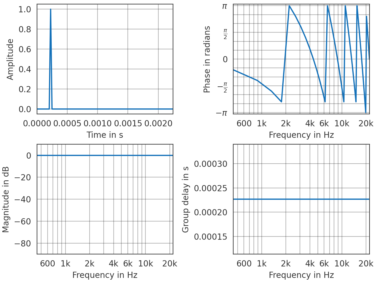
>>> import pyfar as pf
>>> impulse = pf.signals.impulse(100, 10)
>>> plots = [[pf.plot.time, pf.plot.phase],
...          [pf.plot.freq, pf.plot.group_delay]]
>>> pf.plot.custom_subplots(impulse, plots)
(
Source code,png,hires.png,pdf)
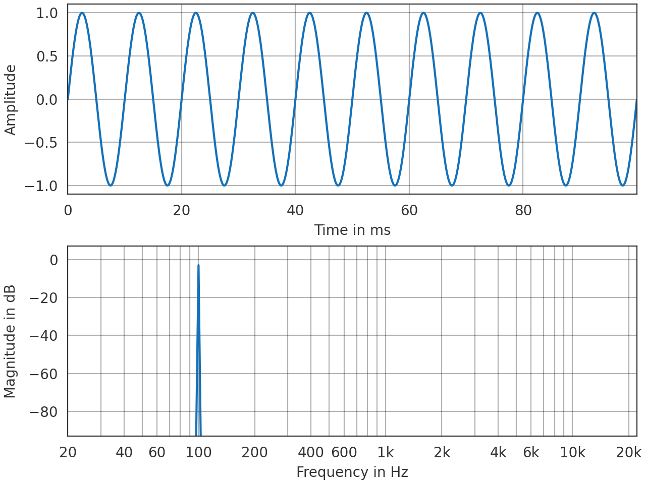
- pyfar.plot.freq(signal, dB=True, log_prefix=None, log_reference=1, freq_scale='log', ax=None, style='light', side='right', mode='abs', **kwargs)[source]#
Plot the magnitude spectrum.
Plots
abs(signal.freq)and passes keyword arguments (kwargs) tomatplotlib.pyplot.plot.- Parameters:
signal (Signal, FrequencyData) – The input data to be plotted. Multidimensional data are flattened for plotting, e.g, a signal of
signal.cshape = (2, 2)would be plotted in the order(0, 0),(0, 1),(1, 0),(1, 1).dB (bool) – Indicate if the data should be plotted in dB in which case
log_prefix * np.log10(abs(signal.freq) / log_reference)is used. The default isTrue.log_prefix (integer, float) – Prefix for calculating the logarithmic frequency data. The default is
None, so10is chosen ifsignal.fft_normis'power'or'psd'and20otherwise.log_reference (integer, float) – Reference for calculating the logarithmic frequency data. The default is
1.freq_scale (str) –
linearorlogto plot on a linear or logarithmic frequency axis. The default islog.ax (matplotlib.axes.Axes) – Axes to plot on. The default is
None, which uses the current axis or creates a new figure if none exists.style (str) –
lightordarkto use the pyfar plot styles or a plot style frommatplotlib.style.available. Pass a dictionary to set specific plot parameters, for examplestyle = {'axes.facecolor':'black'}. Pass an empty dictionarystyle = {}to use the currently active plotstyle. The default islight.side (str, optional) –
'right'to plot the right-sided spectrum containing the positive frequencies, or'left'to plot the left-sided spectrum containing the negative frequencies (only possible for complex Signals). The default is'right'.mode (str, optional) –
'real','imag', or'abs'to specify if the real part, imaginary part or absolute value of the spectrum is plotted. The default isreal.**kwargs – Keyword arguments that are passed to
matplotlib.pyplot.plot.
- Returns:
ax – Axes or array of axes containing the plot.
- Return type:
Example
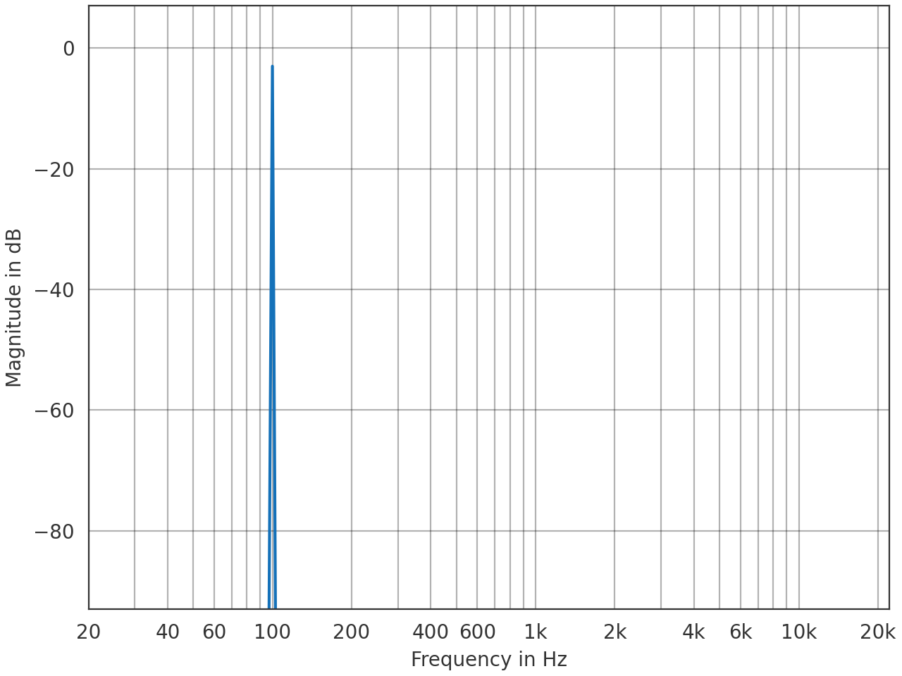
>>> import pyfar as pf
>>> sine = pf.signals.sine(100, 4410)
>>> pf.plot.freq(sine)
(
Source code,png,hires.png,pdf)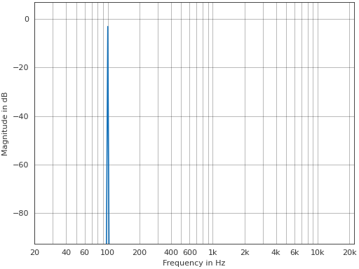
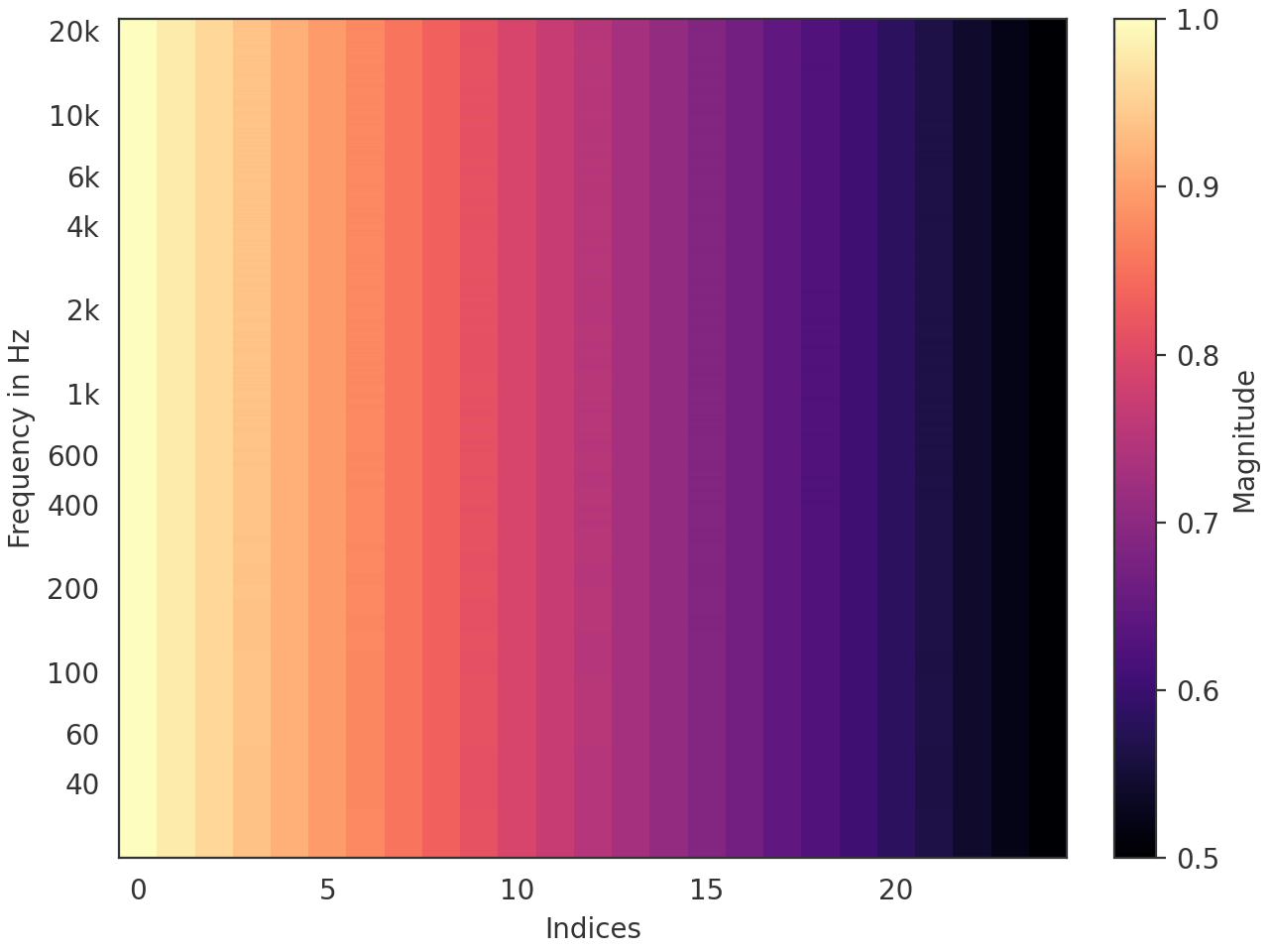
- pyfar.plot.freq_2d(signal, dB=True, log_prefix=None, log_reference=1, freq_scale='log', indices=None, orientation='vertical', method='pcolormesh', colorbar=True, ax=None, style='light', side='right', mode='abs', **kwargs)[source]#
2D color coded plot of magnitude spectra.
Plots
abs(signal.freq)and passes keyword arguments (kwargs) tomatplotlib.pyplot.pcolormeshormatplotlib.pyplot.contourf.- Parameters:
signal (Signal, FrequencyData) – The input data to be plotted. signal.cshape must be (m, ) with m>1.
dB (bool) – Indicate if the data should be plotted in dB in which case
log_prefix * np.log10(abs(signal.freq) / log_reference)is used. The default isTrue.log_prefix (integer, float) – Prefix for calculating the logarithmic frequency data. The default is
None, so10is chosen ifsignal.fft_normis'power'or'psd'and20otherwise.log_reference (integer, float) – Reference for calculating the logarithmic frequency data. The default is
1.freq_scale (str) –
linearorlogto plot on a linear or logarithmic frequency axis. The default islog.indices (array like, optional) – Points at which the channels of signal were sampled (e.g. azimuth angles or x values). indices must be monotonously increasing/ decreasing and have as many entries as signal has channels. The default is
'None'which labels the N channels in signal from 0 to N-1.orientation (string, optional) –
'vertical'The channels of signal will be plotted as as vertical lines.
'horizontal'The channels of signal will be plotted as horizontal lines.
The default is
'vertical'method (string, optional) –
The Matplotlib plotting method.
'pcolormesh'Create a pseudocolor plot with a non-regular rectangular grid. The resolution of the data is clearly visible.
'contourf'Create a filled contour plot. The data is smoothly interpolated, which might mask the data’s resolution.
The default is
'pcolormesh'.colorbar (bool, optional) – Control the colorbar. The default is
True, which adds a colorbar to the plot.Falseomits the colorbar.ax (matplotlib.axes.Axes) –
Axes to plot on.
NoneUse the current axis, or create a new axis (and figure) if there is none.
axIf a single axis is passed, this is used for plotting. If colorbar is
Truethe space for the colorbar is taken from this axis.[ax, ax]If a list or array of two axes is passed, the first is used to plot the data and the second to plot the colorbar. In this case colorbar must be
True.
The default is
None.style (str) –
lightordarkto use the pyfar plot styles or a plot style frommatplotlib.style.available. Pass a dictionary to set specific plot parameters, for examplestyle = {'axes.facecolor':'black'}. Pass an empty dictionarystyle = {}to use the currently active plotstyle. The default islight.side (str, optional) –
'right'to plot the right-sided spectrum containing the positive frequencies, or'left'to plot the left-sided spectrum containing the negative frequencies (only possible for complex Signals). The default is'right'.mode (str, optional) –
'real','imag', or'abs'to specify if the real part, imaginary part or absolute value of the spectrum is plotted. The default isreal.**kwargs – Keyword arguments that are passed to
matplotlib.pyplot.pcolormeshormatplotlib.pyplot.contourf.
- Returns:
ax (matplotlib.axes.Axes) – If colorbar is
Truean array of two axes is returned. The first is the axis on which the data is plotted, the second is the axis of the colorbar. If colorbar isFalse, only the axis on which the data is plotted is returned.quad_mesh (
QuadMesh,matplotlib.contour.QuadContourSet) – The MatplotlibQuadMesh/matplotlib.contour.QuadContourSetcollection. This can be used to manipulate the way the data is displayed, e.g., by limiting the range of the colormap byquad_mesh.set_clim(). It can also be used to generate a colorbar bycb = fig.colorbar(quad_mesh, ...).colorbar (Colorbar) – The Matplotlib colorbar object if colorbar is
TrueandNoneotherwise. This can be used to control the appearance of the colorbar, e.g., the label can be set bycolorbar.set_label().
Example
Plot a 25-channel impulse signal with different delays and amplitudes.
>>> import pyfar as pf
>>> import numpy as np
>>> impulses = pf.signals.impulse(
...     2048, np.arange(0, 25), np.linspace(1, .5, 25))
>>> pf.plot.freq_2d(impulses, dB=False)
(
Source code,png,hires.png,pdf)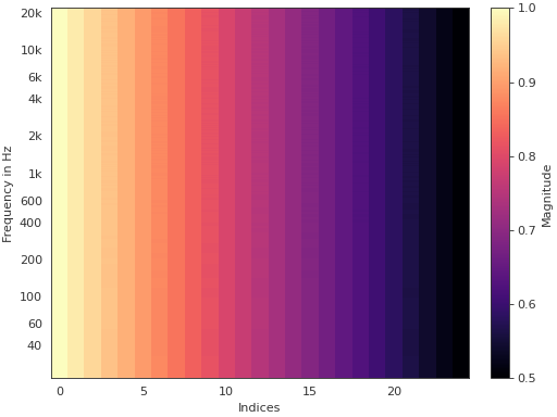
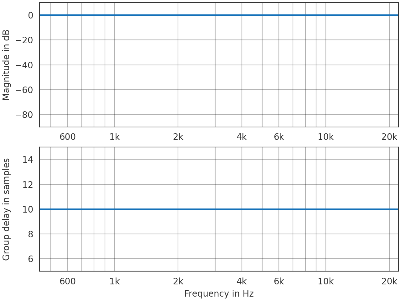
- pyfar.plot.freq_group_delay(signal, dB=True, log_prefix=None, log_reference=1, unit='s', freq_scale='log', ax=None, style='light', side='right', mode='abs', **kwargs)[source]#
Plot the magnitude and group delay spectrum (2 by 1 subplot).
Plots
abs(signal.freq)andpyfar.dsp.group_delay(signal.freq)and passes keyword arguments (kwargs) tomatplotlib.pyplot.plot.- Parameters:
signal (Signal) – The input data to be plotted. Multidimensional data are flattened for plotting, e.g, a signal of
signal.cshape = (2, 2)would be plotted in the order(0, 0),(0, 1),(1, 0),(1, 1).dB (bool) – Flag to plot the logarithmic magnitude spectrum. The default is
True.log_prefix (integer, float) – Prefix for calculating the logarithmic frequency data. The default is
None, so10is chosen ifsignal.fft_normis'power'or'psd'and20otherwise.log_reference (integer) – Reference for calculating the logarithmic frequency data. The default is
1.unit (str, None) –
Set the unit of the time axis.
's'(default)seconds
'ms'milliseconds
'mus'microseconds
'samples'samples
'auto'Use seconds, milliseconds, or microseconds depending on the length of the data.
freq_scale (str) –
linearorlogto plot on a linear or logarithmic frequency axis. The default islog.ax (matplotlib.axes.Axes) – Array or list with two axes to plot on. The default is
None, which uses the current axis or creates a new figure if none exists.style (str) –
lightordarkto use the pyfar plot styles or a plot style frommatplotlib.style.available. Pass a dictionary to set specific plot parameters, for examplestyle = {'axes.facecolor':'black'}. Pass an empty dictionarystyle = {}to use the currently active plotstyle. The default islight.side (str, optional) –
'right'to plot the right-sided spectrum containing the positive frequencies, or'left'to plot the left-sided spectrum containing the negative frequencies (only possible for complex Signals). The default is'right'.mode (str, optional) –
'real','imag', or'abs'to specify if the real part, imaginary part or absolute value of the spectrum is plotted. The default isreal.**kwargs – Keyword arguments that are passed to
matplotlib.pyplot.plot.
- Returns:
ax – Axes or array of axes containing the plot.
- Return type:
Examples
>>> import pyfar as pf
>>> impulse = pf.signals.impulse(100, 10)
>>> pf.plot.freq_group_delay(impulse, unit='samples')
(
Source code,png,hires.png,pdf)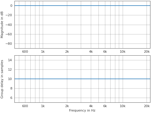
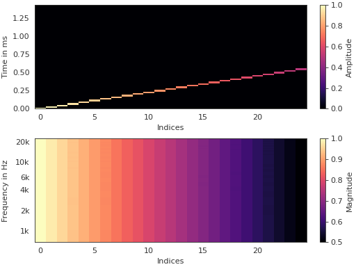
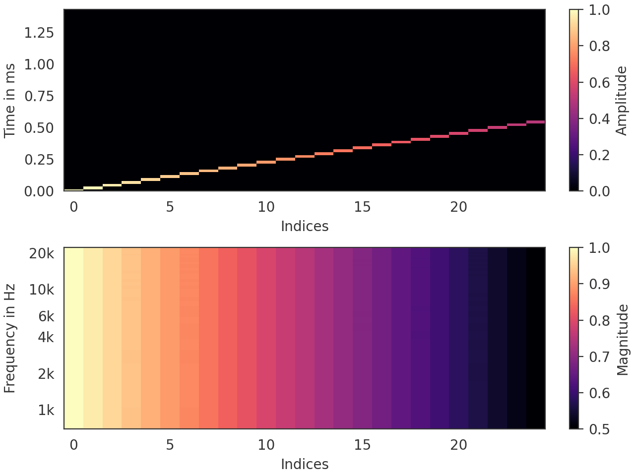
- pyfar.plot.freq_group_delay_2d(signal, dB=True, log_prefix=None, log_reference=1, unit='s', freq_scale='log', indices=None, orientation='vertical', method='pcolormesh', colorbar=True, ax=None, style='light', side='right', mode='abs', **kwargs)[source]#
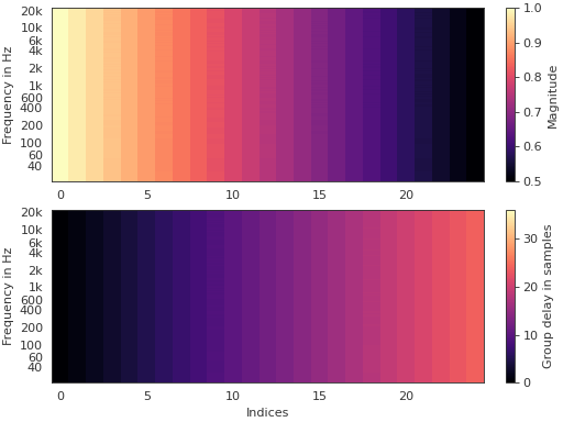
2D color coded plot of magnitude spectra and group delay (2 by 1 subplot).
Plots
abs(signal.freq)andpyfar.dsp.group_delay(signal.freq)and passes keyword arguments (kwargs) tomatplotlib.pyplot.pcolormeshormatplotlib.pyplot.contourf.- Parameters:
signal (Signal) – The input data to be plotted. signal.cshape must be (m, ) with m>1.
dB (bool) – Flag to plot the logarithmic magnitude spectrum. The default is
True.log_prefix (integer, float) – Prefix for calculating the logarithmic frequency data. The default is
None, so10is chosen ifsignal.fft_normis'power'or'psd'and20otherwise.log_reference (integer) – Reference for calculating the logarithmic frequency data. The default is
1.unit (str, None) –
Set the unit of the time axis.
's'(default)seconds
'ms'milliseconds
'mus'microseconds
'samples'samples
'auto'Use seconds, milliseconds, or microseconds depending on the length of the data.
freq_scale (str) –
linearorlogto plot on a linear or logarithmic frequency axis. The default islog.indices (array like, optional) – Points at which the channels of signal were sampled (e.g. azimuth angles or x values). indices must be monotonously increasing/ decreasing and have as many entries as signal has channels. The default is
'None'which labels the N channels in signal from 0 to N-1.orientation (string, optional) –
'vertical'The channels of signal will be plotted as as vertical lines.
'horizontal'The channels of signal will be plotted as horizontal lines.
The default is
'vertical'method (string, optional) –
The Matplotlib plotting method.
'pcolormesh'Create a pseudocolor plot with a non-regular rectangular grid. The resolution of the data is clearly visible.
'contourf'Create a filled contour plot. The data is smoothly interpolated, which might mask the data’s resolution.
The default is
'pcolormesh'.colorbar (bool, optional) – Control the colorbar. The default is
True, which adds a colorbar to the plot.Falseomits the colorbar.ax (matplotlib.axes.Axes) –
Axes to plot on.
NoneUse the current axis, or create a new axis (and figure) if there is none.
[ax, ax]Two axes to plot on. Space for the colorbar of each plot is taken from the provided axes.
The default is
None.style (str) –
lightordarkto use the pyfar plot styles or a plot style frommatplotlib.style.available. Pass a dictionary to set specific plot parameters, for examplestyle = {'axes.facecolor':'black'}. Pass an empty dictionarystyle = {}to use the currently active plotstyle. The default islight.side (str, optional) –
'right'to plot the right-sided spectrum containing the positive frequencies, or'left'to plot the left-sided spectrum containing the negative frequencies (only possible for complex Signals). The default is'right'.mode (str, optional) –
'real','imag', or'abs'to specify if the real part, imaginary part or absolute value of the spectrum is plotted. The default isreal.**kwargs – Keyword arguments that are passed to
matplotlib.pyplot.pcolormeshormatplotlib.pyplot.contourf.
- Returns:
ax (matplotlib.axes.Axes) – If colorbar is
Truean array of four axes is returned. The first two are the axis on which the data is plotted, the last two are the axis of the colorbar. If colorbar isFalse, only the axes on which the data is plotted is returned.quad_mesh (
QuadMesh,matplotlib.contour.QuadContourSet) – The MatplotlibQuadMesh/matplotlib.contour.QuadContourSetcollection. This can be used to manipulate the way the data is displayed, e.g., by limiting the range of the colormap byquad_mesh.set_clim(). It can also be used to generate a colorbar bycb = fig.colorbar(quad_mesh, ...).colorbar (Colorbar) – The Matplotlib colorbar object if colorbar is
TrueandNoneotherwise. This can be used to control the appearance of the colorbar, e.g., the label can be set bycolorbar.set_label().
Examples
Plot a 25-channel impulse signal with different delays and amplitudes.
>>> import pyfar as pf
>>> import numpy as np
>>> impulses = pf.signals.impulse(
...     2048, np.arange(0, 25), np.linspace(1, .5, 25))
>>> pf.plot.freq_group_delay_2d(impulses, dB=False, unit="samples")
(
Source code,png,hires.png,pdf)
- pyfar.plot.freq_phase(signal, dB=True, log_prefix=None, log_reference=1, freq_scale='log', deg=False, unwrap=False, ax=None, style='light', side='right', mode='abs', **kwargs)[source]#
Plot the magnitude and phase spectrum (2 by 1 subplot).
Plots
abs(signal.freq)andangle(signal.freq)and passes keyword arguments (kwargs) tomatplotlib.pyplot.plot.- Parameters:
signal (Signal, FrequencyData) – The input data to be plotted. Multidimensional data are flattened for plotting, e.g, a signal of
signal.cshape = (2, 2)would be plotted in the order(0, 0),(0, 1),(1, 0),(1, 1).dB (bool) – Indicate if the data should be plotted in dB in which case
log_prefix * np.log10(abs(signal.freq) / log_reference)is used. The default isTrue.log_prefix (integer, float) – Prefix for calculating the logarithmic frequency data. The default is
None, so10is chosen ifsignal.fft_normis'power'or'psd'and20otherwise.log_reference (integer) – Reference for calculating the logarithmic frequency data. The default is
1.deg (bool) – Flag to plot the phase in degrees. The default is
False.unwrap (bool, str) – True to unwrap the phase or
'360'to unwrap the phase to 2 pi. The default isFalse.freq_scale (str) –
linearorlogto plot on a linear or logarithmic frequency axis. The default islog.ax (matplotlib.axes.Axes) – Array or list with two axes to plot on. The default is
None, which uses the current axis or creates a new figure if none exists.style (str) –
lightordarkto use the pyfar plot styles or a plot style frommatplotlib.style.available. Pass a dictionary to set specific plot parameters, for examplestyle = {'axes.facecolor':'black'}. Pass an empty dictionarystyle = {}to use the currently active plotstyle. The default islight.side (str, optional) –
'right'to plot the right-sided spectrum containing the positive frequencies, or'left'to plot the left-sided spectrum containing the negative frequencies (only possible for complex Signals). The default is'right'.mode (str, optional) –
'real','imag', or'abs'to specify if the real part, imaginary part or absolute value of the spectrum is plotted. The default isreal.**kwargs – Keyword arguments that are forwarded to matplotlib.pyplot.plot
- Returns:
ax – Axes or array of axes containing the plot.
- Return type:
Examples
>>> import pyfar as pf
>>> impulse = pf.signals.impulse(100, 10)
>>> pf.plot.freq_phase(impulse, unwrap=True)
(
Source code,png,hires.png,pdf)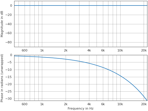
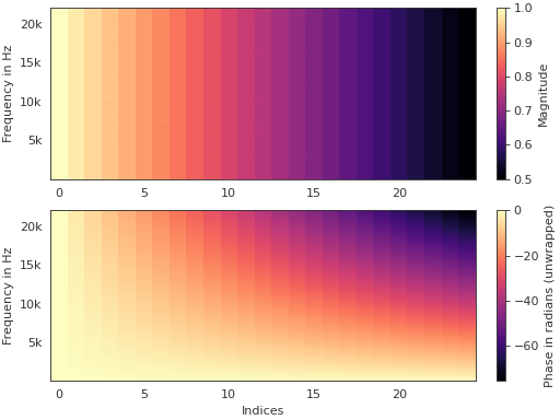
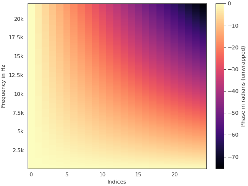
- pyfar.plot.freq_phase_2d(signal, dB=True, log_prefix=None, log_reference=1, freq_scale='log', deg=False, unwrap=False, indices=None, orientation='vertical', method='pcolormesh', colorbar=True, ax=None, style='light', side='right', mode='abs', **kwargs)[source]#
2D color coded plot of magnitude and phase spectra (2 by 1 subplot).
Plots
abs(signal.freq)andangle(signal.freq)and passes keyword arguments (kwargs) tomatplotlib.pyplot.pcolormeshormatplotlib.pyplot.contourf.- Parameters:
signal (Signal, FrequencyData) – The input data to be plotted. signal.cshape must be (m, ) with m>1.
dB (bool) – Indicate if the data should be plotted in dB in which case
log_prefix * np.log10(abs(signal.freq) / log_reference)is used. The default isTrue.log_prefix (integer, float) – Prefix for calculating the logarithmic frequency data. The default is
None, so10is chosen ifsignal.fft_normis'power'or'psd'and20otherwise.log_reference (integer) – Reference for calculating the logarithmic frequency data. The default is
1.deg (bool) – Flag to plot the phase in degrees. The default is
False.unwrap (bool, str) – True to unwrap the phase or
'360'to unwrap the phase to 2 pi. The default isFalse.freq_scale (str) –
linearorlogto plot on a linear or logarithmic frequency axis. The default islog.indices (array like, optional) – Points at which the channels of signal were sampled (e.g. azimuth angles or x values). indices must be monotonously increasing/ decreasing and have as many entries as signal has channels. The default is
'None'which labels the N channels in signal from 0 to N-1.orientation (string, optional) –
'vertical'The channels of signal will be plotted as as vertical lines.
'horizontal'The channels of signal will be plotted as horizontal lines.
The default is
'vertical'method (string, optional) –
The Matplotlib plotting method.
'pcolormesh'Create a pseudocolor plot with a non-regular rectangular grid. The resolution of the data is clearly visible.
'contourf'Create a filled contour plot. The data is smoothly interpolated, which might mask the data’s resolution.
The default is
'pcolormesh'.colorbar (bool, optional) – Control the colorbar. The default is
True, which adds a colorbar to the plot.Falseomits the colorbar.ax (matplotlib.axes.Axes) –
Axes to plot on.
NoneUse the current axis, or create a new axis (and figure) if there is none.
[ax, ax]Two axes to plot on. Space for the colorbar of each plot is taken from the provided axes.
The default is
None.style (str) –
lightordarkto use the pyfar plot styles or a plot style frommatplotlib.style.available. Pass a dictionary to set specific plot parameters, for examplestyle = {'axes.facecolor':'black'}. Pass an empty dictionarystyle = {}to use the currently active plotstyle. The default islight.side (str, optional) –
'right'to plot the right-sided spectrum containing the positive frequencies, or'left'to plot the left-sided spectrum containing the negative frequencies (only possible for complex Signals). The default is'right'.mode (str, optional) –
'real','imag', or'abs'to specify if the real part, imaginary part or absolute value of the spectrum is plotted. The default isreal.**kwargs – Keyword arguments that are passed to
matplotlib.pyplot.pcolormeshormatplotlib.pyplot.contourf.
- Returns:
ax (matplotlib.axes.Axes) – If colorbar is
Truean array of four axes is returned. The first two are the axis on which the data is plotted, the last two are the axis of the colorbar. If colorbar isFalse, only the axes on which the data is plotted is returned.quad_mesh (
QuadMesh,matplotlib.contour.QuadContourSet) – The MatplotlibQuadMesh/matplotlib.contour.QuadContourSetcollection. This can be used to manipulate the way the data is displayed, e.g., by limiting the range of the colormap byquad_mesh.set_clim(). It can also be used to generate a colorbar bycb = fig.colorbar(quad_mesh, ...).colorbar (Colorbar) – The Matplotlib colorbar object if colorbar is
TrueandNoneotherwise. This can be used to control the appearance of the colorbar, e.g., the label can be set bycolorbar.set_label().
Examples
Plot a 25-channel impulse signal with different delays and amplitudes.
>>> import pyfar as pf
>>> import numpy as np
>>> impulses = pf.signals.impulse(
...     2048, np.arange(0, 25), np.linspace(1, .5, 25))
>>> pf.plot.freq_phase_2d(impulses, dB=False, unwrap=True,
...                       freq_scale="linear")
(
Source code,png,hires.png,pdf)
- pyfar.plot.group_delay(signal, unit='s', freq_scale='log', ax=None, style='light', side='right', **kwargs)[source]#
Plot the group delay.
Plots
pyfar.dsp.group_delay(signal.freq)and passes keyword arguments (kwargs) tomatplotlib.pyplot.plot.- Parameters:
signal (Signal) – The input data to be plotted. Multidimensional data are flattened for plotting, e.g, a signal of
signal.cshape = (2, 2)would be plotted in the order(0, 0),(0, 1),(1, 0),(1, 1).unit (str, None) –
Set the unit of the time axis.
's'(default)seconds
'ms'milliseconds
'mus'microseconds
'samples'samples
'auto'Use seconds, milliseconds, or microseconds depending on the length of the data.
freq_scale (str) –
linearorlogto plot on a linear or logarithmic frequency axis. The default islog.ax (matplotlib.axes.Axes) – Axes to plot on. The default is
None, which uses the current axis or creates a new figure if none exists.style (str) –
lightordarkto use the pyfar plot styles or a plot style frommatplotlib.style.available. Pass a dictionary to set specific plot parameters, for examplestyle = {'axes.facecolor':'black'}. Pass an empty dictionarystyle = {}to use the currently active plotstyle. The default islight.side (str, optional) –
'right'to plot the right-sided spectrum containing the positive frequencies, or'left'to plot the left-sided spectrum containing the negative frequencies (only possible for complex Signals). The default is'right'.**kwargs – Keyword arguments that are passed to
matplotlib.pyplot.plot.
- Returns:
ax – Axes or array of axes containing the plot.
- Return type:
Examples
>>> import pyfar as pf
>>> impulse = pf.signals.impulse(100, 10)
>>> pf.plot.group_delay(impulse, unit='samples')
(
Source code,png,hires.png,pdf)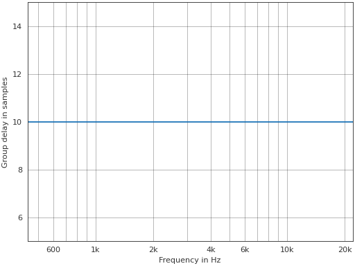
- pyfar.plot.group_delay_2d(signal, unit='s', freq_scale='log', indices=None, orientation='vertical', method='pcolormesh', colorbar=True, ax=None, style='light', side='right', **kwargs)[source]#
2D color coded plot of the group delay.
Plots
pyfar.dsp.group_delay(signal.freq)and passes keyword arguments (kwargs) tomatplotlib.pyplot.pcolormeshormatplotlib.pyplot.contourf.- Parameters:
signal (Signal) – The input data to be plotted. signal.cshape must be (m, ) with m>1.
unit (str, None) –
Set the unit of the time axis.
's'(default)seconds
'ms'milliseconds
'mus'microseconds
'samples'samples
'auto'Use seconds, milliseconds, or microseconds depending on the length of the data.
freq_scale (str) –
linearorlogto plot on a linear or logarithmic frequency axis. The default islog.indices (array like, optional) – Points at which the channels of signal were sampled (e.g. azimuth angles or x values). indices must be monotonously increasing/ decreasing and have as many entries as signal has channels. The default is
'None'which labels the N channels in signal from 0 to N-1.orientation (string, optional) –
'vertical'The channels of signal will be plotted as as vertical lines.
'horizontal'The channels of signal will be plotted as horizontal lines.
The default is
'vertical'method (string, optional) –
The Matplotlib plotting method.
'pcolormesh'Create a pseudocolor plot with a non-regular rectangular grid. The resolution of the data is clearly visible.
'contourf'Create a filled contour plot. The data is smoothly interpolated, which might mask the data’s resolution.
The default is
'pcolormesh'.colorbar (bool, optional) – Control the colorbar. The default is
True, which adds a colorbar to the plot.Falseomits the colorbar.ax (matplotlib.axes.Axes) –
Axes to plot on.
NoneUse the current axis, or create a new axis (and figure) if there is none.
axIf a single axis is passed, this is used for plotting. If colorbar is
Truethe space for the colorbar is taken from this axis.[ax, ax]If a list or array of two axes is passed, the first is used to plot the data and the second to plot the colorbar. In this case colorbar must be
True.
The default is
None.style (str) –
lightordarkto use the pyfar plot styles or a plot style frommatplotlib.style.available. Pass a dictionary to set specific plot parameters, for examplestyle = {'axes.facecolor':'black'}. Pass an empty dictionarystyle = {}to use the currently active plotstyle. The default islight.side (str, optional) –
'right'to plot the right-sided spectrum containing the positive frequencies, or'left'to plot the left-sided spectrum containing the negative frequencies (only possible for complex Signals). The default is'right'.**kwargs – Keyword arguments that are passed to
matplotlib.pyplot.pcolormeshormatplotlib.pyplot.contourf.
- Returns:
ax (matplotlib.axes.Axes) – If colorbar is
Truean array of four axes is returned. The first two are the axis on which the data is plotted, the last two are the axis of the colorbar. If colorbar isFalse, only the axes on which the data is plotted is returned.quad_mesh (
QuadMesh,matplotlib.contour.QuadContourSet) – The MatplotlibQuadMesh/matplotlib.contour.QuadContourSetcollection. This can b used to manipulate the way the data is displayed, e.g., by limiting the range of the colormap byquad_mesh.set_clim(). It can also be used to generate a colorbar bycb = fig.colorbar(quad_mesh, ...).colorbar (Colorbar) – The Matplotlib colorbar object if colorbar is
TrueandNoneotherwise. This can be used to control the appearance of the colorbar, e.g., the label can be set bycolorbar.set_label().
Example
Plot a 25-channel impulse signal with different delays and amplitudes.
>>> import pyfar as pf
>>> import numpy as np
>>> impulses = pf.signals.impulse(
...     2048, np.arange(0, 25), np.linspace(1, .5, 25))
>>> pf.plot.group_delay_2d(impulses, unit="samples")
(
Source code,png,hires.png,pdf)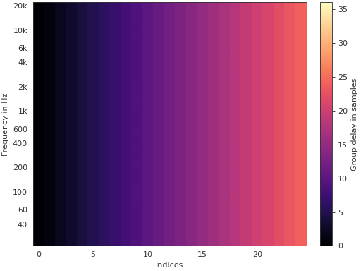
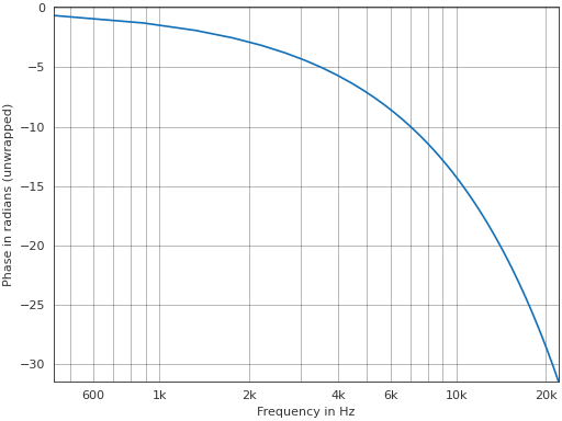
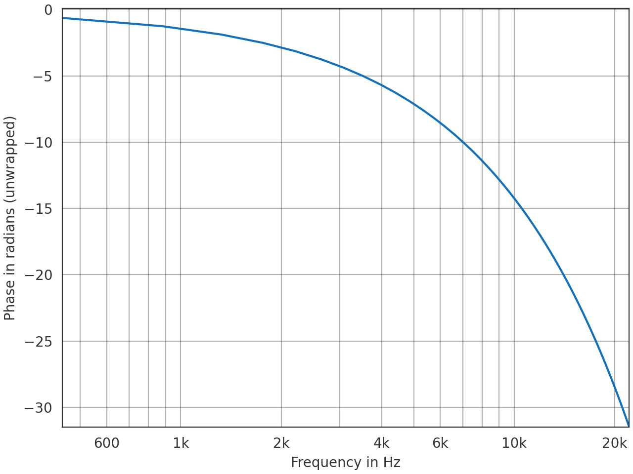
- pyfar.plot.phase(signal, deg=False, unwrap=False, freq_scale='log', ax=None, style='light', side='right', **kwargs)[source]#
Plot the phase of the spectrum.
Plots
angle(signal.freq)and passes keyword arguments (kwargs) tomatplotlib.pyplot.plot.- Parameters:
signal (Signal, FrequencyData) – The input data to be plotted. Multidimensional data are flattened for plotting, e.g, a signal of
signal.cshape = (2, 2)would be plotted in the order(0, 0),(0, 1),(1, 0),(1, 1).deg (bool) – Plot the phase in degrees. The default is
False, which plots the phase in radians.unwrap (bool, str) – True to unwrap the phase or
'360'to unwrap the phase to 2 pi. The default isFalse, which plots the wrapped phase.freq_scale (str) –
linearorlogto plot on a linear or logarithmic frequency axis. The default islog.ax (matplotlib.axes.Axes) – Axes to plot on. The default is
None, which uses the current axis or creates a new figure if none exists.style (str) –
lightordarkto use the pyfar plot styles or a plot style frommatplotlib.style.available. Pass a dictionary to set specific plot parameters, for examplestyle = {'axes.facecolor':'black'}. Pass an empty dictionarystyle = {}to use the currently active plotstyle. The default islight.side (str, optional) –
'right'to plot the right-sided spectrum containing the positive frequencies, or'left'to plot the left-sided spectrum containing the negative frequencies (only possible for complex Signals). The default is'right'.**kwargs – Keyword arguments that are passed to
matplotlib.pyplot.plot.
- Returns:
ax – Axes or array of axes containing the plot.
- Return type:
Example
>>> import pyfar as pf
>>> impulse = pf.signals.impulse(100, 10)
>>> pf.plot.phase(impulse, unwrap=True)
(
Source code,png,hires.png,pdf)
- pyfar.plot.phase_2d(signal, deg=False, unwrap=False, freq_scale='log', indices=None, orientation='vertical', method='pcolormesh', colorbar=True, ax=None, style='light', side='right', **kwargs)[source]#
2D color coded plot of phase spectra.
Plots
angle(signal.freq)and passes keyword arguments (kwargs) tomatplotlib.pyplot.pcolormeshormatplotlib.pyplot.contourf.- Parameters:
signal (Signal, FrequencyData) – The input data to be plotted. signal.cshape must be (m, ) with m>1.
deg (bool) – Plot the phase in degrees. The default is
False, which plots the phase in radians.unwrap (bool, str) – True to unwrap the phase or
'360'to unwrap the phase to 2 pi. The default isFalse, which plots the wrapped phase.freq_scale (str) –
linearorlogto plot on a linear or logarithmic frequency axis. The default islog.indices (array like, optional) – Points at which the channels of signal were sampled (e.g. azimuth angles or x values). indices must be monotonously increasing/ decreasing and have as many entries as signal has channels. The default is
'None'which labels the N channels in signal from 0 to N-1.orientation (string, optional) –
'vertical'The channels of signal will be plotted as as vertical lines.
'horizontal'The channels of signal will be plotted as horizontal lines.
The default is
'vertical'method (string, optional) –
The Matplotlib plotting method.
'pcolormesh'Create a pseudocolor plot with a non-regular rectangular grid. The resolution of the data is clearly visible.
'contourf'Create a filled contour plot. The data is smoothly interpolated, which might mask the data’s resolution.
The default is
'pcolormesh'.colorbar (bool, optional) – Control the colorbar. The default is
True, which adds a colorbar to the plot.Falseomits the colorbar.ax (matplotlib.axes.Axes) –
Axes to plot on.
NoneUse the current axis, or create a new axis (and figure) if there is none.
axIf a single axis is passed, this is used for plotting. If colorbar is
Truethe space for the colorbar is taken from this axis.[ax, ax]If a list or array of two axes is passed, the first is used to plot the data and the second to plot the colorbar. In this case colorbar must be
True.
The default is
None.style (str) –
lightordarkto use the pyfar plot styles or a plot style frommatplotlib.style.available. Pass a dictionary to set specific plot parameters, for examplestyle = {'axes.facecolor':'black'}. Pass an empty dictionarystyle = {}to use the currently active plotstyle. The default islight.side (str, optional) –
'right'to plot the right-sided spectrum containing the positive frequencies, or'left'to plot the left-sided spectrum containing the negative frequencies (only possible for complex Signals). The default is'right'.**kwargs – Keyword arguments that are passed to
matplotlib.pyplot.pcolormeshormatplotlib.pyplot.contourf.
- Returns:
ax (matplotlib.axes.Axes) – If colorbar is
Truean array of two axes is returned. The first is the axis on which the data is plotted, the second is the axis of the colorbar. If colorbar isFalse, only the axis on which the data is plotted is returned.quad_mesh (
QuadMesh,matplotlib.contour.QuadContourSet) – The MatplotlibQuadMesh/matplotlib.contour.QuadContourSetcollection. This can be used to manipulate the way the data is displayed, e.g., by limiting the range of the colormap byquad_mesh.set_clim(). It can also be used to generate a colorbar bycb = fig.colorbar(quad_mesh, ...).colorbar (Colorbar) – The Matplotlib colorbar object if colorbar is
TrueandNoneotherwise. This can be used to control the appearance of the colorbar, e.g., the label can be set bycolorbar.set_label().
Example
Plot a 25-channel impulse signal with different delays and amplitudes.
>>> import pyfar as pf
>>> import numpy as np
>>> impulses = pf.signals.impulse(
...     2048, np.arange(0, 25), np.linspace(1, .5, 25))
>>> pf.plot.phase_2d(impulses, unwrap=True, freq_scale="linear")
(
Source code,png,hires.png,pdf)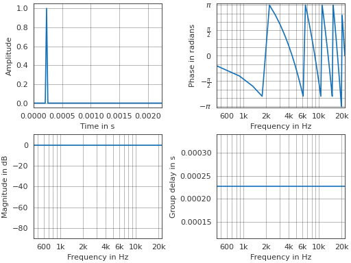
- pyfar.plot.plotstyle(style='light')[source]#
Get the fullpath of the pyfar plotstyles
lightordark.The plotstyles are defined by mplstyle files, which is Matplotlibs format to define styles. By default, pyfar uses the
lightplotstyle.- Parameters:
style (str) –
lightordark- Returns:
style – Full path to the pyfar plotstyle.
- Return type:
str
See also
- pyfar.plot.shortcuts(show=True, report=False, layout='console')[source]#
Show and return keyboard shortcuts for interactive figures.
Note that the shortcuts are only available if using an interactive Matplotlib backend
Use these shortcuts to toggle between plots
Key
Plot
1, shift+t
2, shift+f
3, shift+p
4, shift+g
5, shift+s
6, ctrl+shift+t, ctrl+shift+f
7, ctrl+shift+p
8, ctrl+shift+g
Note that not all plots are available for TimeData and FrequencyData objects as detailed in the
plot moduledocumentation.Use these shortcuts to control the plot
Key
Action
left
move x-axis view to the left
right
move x-axis view to the right
up
move y-axis view upwards
down
y-axis view downwards
+, ctrl+shift+up
move colormap range up
-, ctrl+shift+down
move colormap range down
shift+right
zoom in x-axis
shift+left
zoom out x-axis
shift+up
zoom out y-axis
shift+down
zoom in y-axis
shift+plus, alt+shift+up
zoom colormap range in
shift+minus, alt+shift+down
zoom colormap range out
shift+x
toggle x-axis unit or scale (see below for more information)
shift+y
toggle y-axis unit or scale (see below for more information)
shift+c
toggle colormap unit (see below for more information)
shift+m
toggle showing real, imaginary, or absolute data.
shift+o
toggle left or right-sided spectrum of complex signals
shift+a
toggle between plotting all channels and plotting single channels
<
cycle between line and 2D plots
>
toggle between vertical and horizontal orientation of 2D plots
., ]
show next channel
,, [
show previous channel
Notes on plot controls
Moving and zooming the x and y axes is supported by all plots.
Moving and zooming the colormap is only supported by plots that have a colormap.
Toggling the x-axis, y-axis and colormap toggles between
linear and logarithmic axis scaling for frequency axes,
seconds, milliseconds, microseconds, and samples for time axes,
linear amplitude and amplitude in dB for axes showing amplitudes,
wrapped and unwrapped phase for axes showing phase phase information.
Toggling the x-axis style is supported by:
time,freq,phase,group_delay,spectrogram,time_freq,freq_phase,freq_group_delay(and their 2d versions)Toggling the y-axis style is supported by:
time,freq,phase,group_delay,spectrogram,time_freq,freq_phase,freq_group_delay(and their 2d versions)Toggling the colormap style is supported by all 2d plots
Toggling between line and 2D plots is not supported by:
spectrogramToggling between the left and right sided spectrum is supported by all frequency domain plots of complexSignals,
Toggling between absolute, real, and imaginary values is supported for
timeandfreq(and their 2d versions) if plotting complex signals.
- Parameters:
show (bool, optional) – Output the keyboard shortcuts to the default console. The default is
True.report (bool, optional) – Return the console output as a string. The default is
False.layout (str, optional) – Specify the layout of the output.
'console'for printing to console and'sphinx'for generating sphinx readable output. The default is'console'.
- Returns:
short_cuts (dict) – Dictionary that contains all the shortcuts.
output (str, optional) – The console output as a string. Only returned if report is
True.
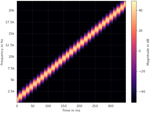
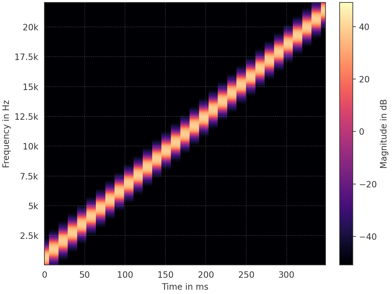
- pyfar.plot.spectrogram(signal, dB=True, log_prefix=None, log_reference=1, freq_scale='linear', unit='s', window='hann', window_length=1024, window_overlap_fct=0.5, colorbar=True, ax=None, style='light', side='right', **kwargs)[source]#
Plot blocks of the magnitude spectrum versus time.
- Parameters:
signal (Signal) – The input data to be plotted. Multidimensional data are flattened for plotting, e.g, a signal of
signal.cshape = (2, 2)would be plotted in the order(0, 0),(0, 1),(1, 0),(1, 1).dB (bool) – Indicate if the data should be plotted in dB in which case
log_prefix * np.log10(abs(signal.freq) / log_reference)is used. The default isTrue.log_prefix (integer, float) – Prefix for calculating the logarithmic frequency data. The default is
None, so10is chosen ifsignal.fft_normis'power'or'psd'and20otherwise.log_reference (integer) – Reference for calculating the logarithmic frequency data. The default is
1.freq_scale (str) –
linearorlogto plot on a linear or logarithmic frequency axis. The default islinear.unit (str, None) –
Set the unit of the time axis.
's'(default)seconds
'ms'milliseconds
'mus'microseconds
'samples'samples
'auto'Use seconds, milliseconds, or microseconds depending on the length of the data.
window (str) – Specifies the window that is applied to each block of the time data before applying the Fourier transform. The default is
hann. Seescipy.signal.get_windowfor a list of possible windows.window_length (integer) – Specifies the window/block length in samples. The default is
1024.window_overlap_fct (double) – Ratio of indices to overlap between blocks [0…1]. The default is
0.5, which would result in 512 samples overlap for a window length of 1024 samples.colorbar (bool, optional) – Control the colorbar. The default is
True, which adds a colorbar to the plot.Falseomits the colorbar.ax (matplotlib.axes.Axes) –
Axes to plot on.
NoneUse the current axis, or create a new axis (and figure) if there is none.
axIf a single axis is passed, this is used for plotting. If colorbar is
Truethe space for the colorbar is taken from this axis.[ax, ax]If a list or array of two axes is passed, the first is used to plot the data and the second to plot the colorbar. In this case colorbar must be
True.
The default is
None.style (str) –
lightordarkto use the pyfar plot styles or a plot style frommatplotlib.style.available. Pass a dictionary to set specific plot parameters, for examplestyle = {'axes.facecolor':'black'}. Pass an empty dictionarystyle = {}to use the currently active plotstyle. The default islight.side (str, optional) –
'right'to plot the right-sided spectrum containing the positive frequencies, or'left'to plot the left-sided spectrum containing the negative frequencies (only possible for complex Signals). The default is'right'.**kwargs – Keyword arguments that are passed to
matplotlib.pyplot.pcolormeshormatplotlib.pyplot.contourf.
- Returns:
ax (matplotlib.axes.Axes) – If colorbar is
Truean array of two axes is returned. The first is the axis on which the data is plotted, the second is the axis of the colorbar. If colorbar isFalse, only the axis on which the data is plotted is returned.quad_mesh (
QuadMesh,matplotlib.contour.QuadContourSet) – The MatplotlibQuadMeshcollection. This can be used to manipulate the way the data is displayed, e.g., by limiting the range of the colormap byquad_mesh.set_clim(). It can also be used to generate a colorbar bycb = fig.colorbar(quad_mesh, ...).colorbar (Colorbar) – The Matplotlib colorbar object if colorbar is
TrueandNoneotherwise. This can be used to control the appearance of the colorbar, e.g., the label can be set bycolorbar.set_label().
Example
Plot the spectrogram of a linear sweep
>>> import pyfar as pf
>>> sweep = pf.signals.linear_sweep_time(2**14, [0, 22050])
>>> pf.plot.spectrogram(sweep, unit='ms')
(
Source code,png,hires.png,pdf)
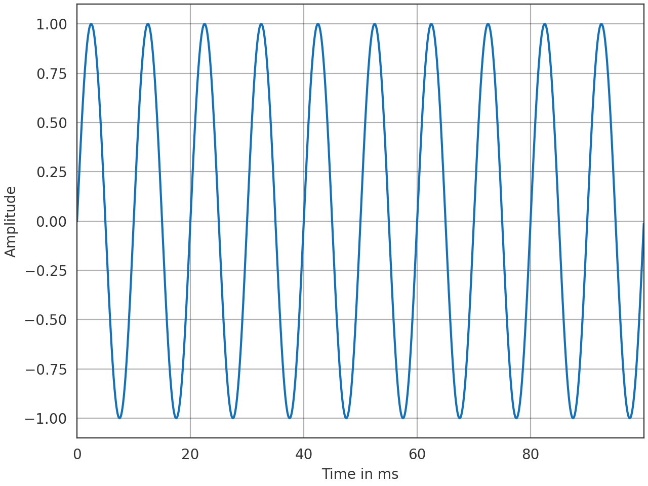
- pyfar.plot.time(signal, dB=False, log_prefix=20, log_reference=1, unit='s', ax=None, style='light', mode='real', **kwargs)[source]#
Plot the time signal.
Plots
signal.timeand passes keyword arguments (kwargs) tomatplotlib.pyplot.plot.- Parameters:
signal (Signal, TimeData) – The input data to be plotted. Multidimensional data are flattened for plotting, e.g, a signal of
signal.cshape = (2, 2)would be plotted in the order(0, 0),(0, 1),(1, 0),(1, 1).dB (bool) – Indicate if the data should be plotted in dB in which case
log_prefix * np.log10(signal.time / log_reference)is used. The default isFalse.log_prefix (integer, float) – Prefix for calculating the logarithmic time data. The default is
20.log_reference (integer) – Reference for calculating the logarithmic time data. The default is
1.unit (str, None) –
Set the unit of the time axis.
's'(default)seconds
'ms'milliseconds
'mus'microseconds
'samples'samples
'auto'Use seconds, milliseconds, or microseconds depending on the length of the data.
ax (matplotlib.axes.Axes) – Axes to plot on. The default is
None, which uses the current axis or creates a new figure if none exists.style (str) –
lightordarkto use the pyfar plot styles or a plot style frommatplotlib.style.available. Pass a dictionary to set specific plot parameters, for examplestyle = {'axes.facecolor':'black'}. Pass an empty dictionarystyle = {}to use the currently active plotstyle. The default islight.mode (str, optional) –
real,imag, orabsto specify if the real part, imaginary part or absolute value of the time data is plotted.'imag'and'abs'`can only be used for complex Signals. The default isreal.**kwargs – Keyword arguments that are passed to
matplotlib.pyplot.plot.
- Returns:
ax – Axes or array of axes containing the plot.
- Return type:
Examples
>>> import pyfar as pf
>>> sine = pf.signals.sine(100, 4410)
>>> pf.plot.time(sine, unit='ms')
(
Source code,png,hires.png,pdf)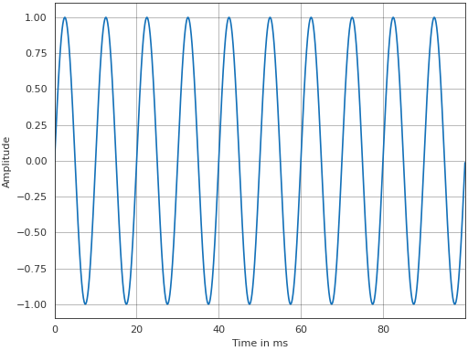
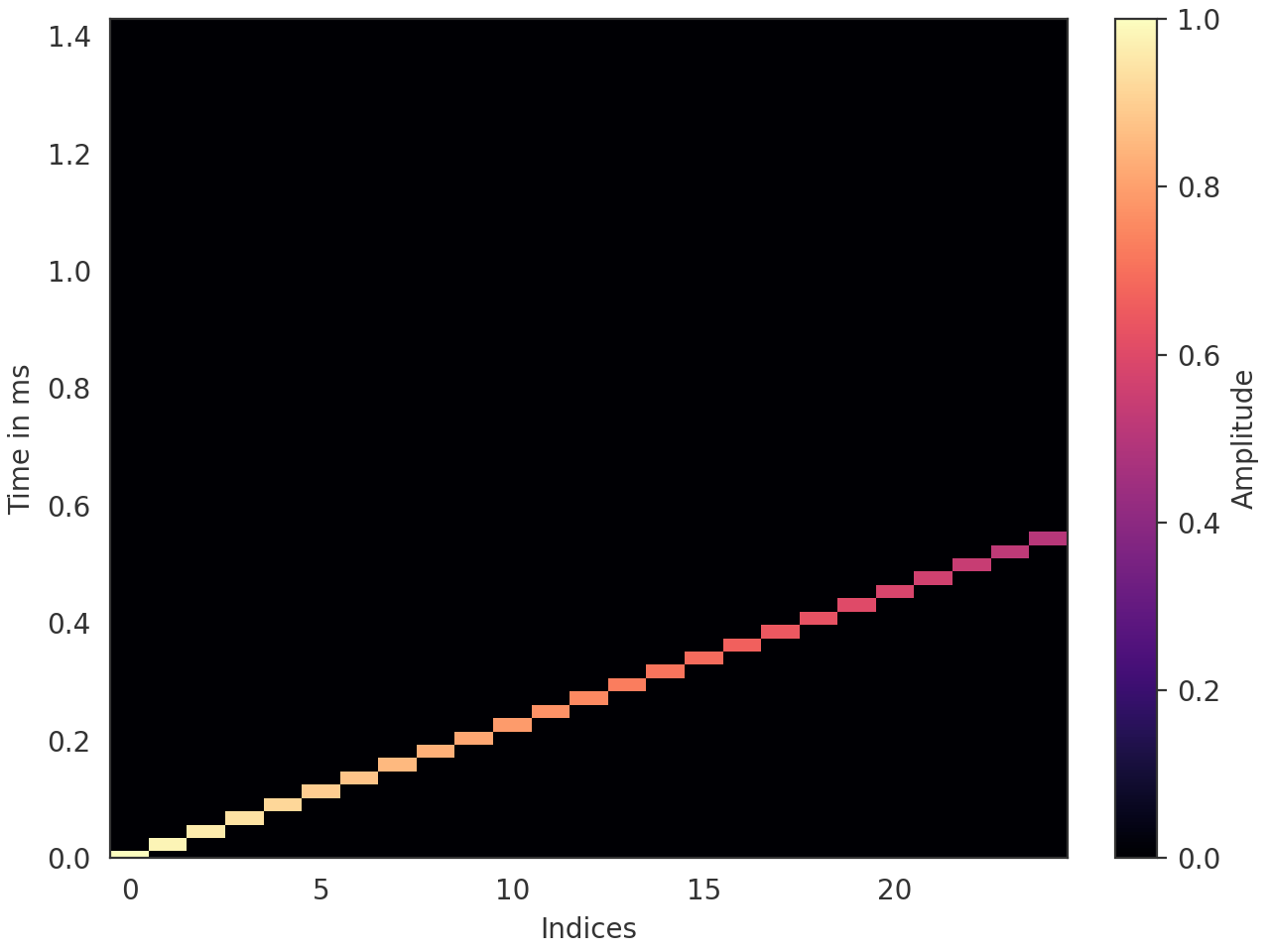
- pyfar.plot.time_2d(signal, dB=False, log_prefix=None, log_reference=1, unit='s', indices=None, orientation='vertical', method='pcolormesh', colorbar=True, ax=None, style='light', mode='real', **kwargs)[source]#
2D color coded plot of time signals.
Plots
signal.timeand passes keyword arguments (kwargs) tomatplotlib.pyplot.pcolormeshormatplotlib.pyplot.contourf.- Parameters:
signal (Signal, TimeData) – The input data to be plotted. signal.cshape must be (m, ) with m>1.
dB (bool) – Indicate if the data should be plotted in dB in which case
log_prefix * np.log10(signal.time / log_reference)is used. The default isFalse.log_prefix (integer, float) – Prefix for calculating the logarithmic frequency data. The default is
None, so10is chosen ifsignal.fft_normis'power'or'psd'and20otherwise.log_reference (integer) – Reference for calculating the logarithmic time data. The default is
1.unit (str, None) –
Set the unit of the time axis.
's'(default)seconds
'ms'milliseconds
'mus'microseconds
'samples'samples
'auto'Use seconds, milliseconds, or microseconds depending on the length of the data.
indices (array like, optional) – Points at which the channels of signal were sampled (e.g. azimuth angles or x values). indices must be monotonously increasing/ decreasing and have as many entries as signal has channels. The default is
'None'which labels the N channels in signal from 0 to N-1.orientation (string, optional) –
'vertical'The channels of signal will be plotted as as vertical lines.
'horizontal'The channels of signal will be plotted as horizontal lines.
The default is
'vertical'method (string, optional) –
The Matplotlib plotting method.
'pcolormesh'Create a pseudocolor plot with a non-regular rectangular grid. The resolution of the data is clearly visible.
'contourf'Create a filled contour plot. The data is smoothly interpolated, which might mask the data’s resolution.
The default is
'pcolormesh'.colorbar (bool, optional) – Control the colorbar. The default is
True, which adds a colorbar to the plot.Falseomits the colorbar.ax (matplotlib.axes.Axes) –
Axes to plot on.
NoneUse the current axis, or create a new axis (and figure) if there is none.
axIf a single axis is passed, this is used for plotting. If colorbar is
Truethe space for the colorbar is taken from this axis.[ax, ax]If a list or array of two axes is passed, the first is used to plot the data and the second to plot the colorbar. In this case colorbar must be
True.
The default is
None.style (str) –
lightordarkto use the pyfar plot styles or a plot style frommatplotlib.style.available. Pass a dictionary to set specific plot parameters, for examplestyle = {'axes.facecolor':'black'}. Pass an empty dictionarystyle = {}to use the currently active plotstyle. The default islight.mode (str, optional) –
real,imag, orabsto specify if the real part, imaginary part or absolute value of the time data is plotted.'imag'and'abs'`can only be used for complex Signals. The default isreal.**kwargs – Keyword arguments that are passed to
matplotlib.pyplot.pcolormeshormatplotlib.pyplot.contourf.
- Returns:
ax (matplotlib.axes.Axes) – If colorbar is
Truean array of two axes is returned. The first is the axis on which the data is plotted, the second is the axis of the colorbar. If colorbar isFalse, only the axis on which the data is plotted is returned.quad_mesh (
QuadMesh,matplotlib.contour.QuadContourSet) – The MatplotlibQuadMesh/matplotlib.contour.QuadContourSetcollection. This can be used to manipulate the way the data is displayed, e.g., by limiting the range of the colormap byquad_mesh.set_clim(). It can also be used to generate a colorbar bycb = fig.colorbar(quad_mesh, ...).colorbar (Colorbar) – The Matplotlib colorbar object if colorbar is
TrueandNoneotherwise. This can be used to control the appearance of the colorbar, e.g., the label can be set bycolorbar.set_label().
Examples
Plot a 25-channel impulse signal with different delays and amplitudes.
>>> import pyfar as pf
>>> import numpy as np
>>> impulses = pf.signals.impulse(
...     64, np.arange(0, 25), np.linspace(1, .5, 25))
>>> pf.plot.time_2d(impulses, unit='ms')
(
Source code,png,hires.png,pdf)
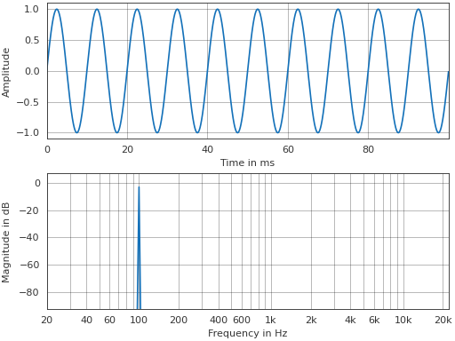
- pyfar.plot.time_freq(signal, dB_time=False, dB_freq=True, log_prefix_time=20, log_prefix_freq=None, log_reference=1, freq_scale='log', unit='s', ax=None, style='light', mode_time='real', side='right', mode_freq='abs', **kwargs)[source]#
Plot the time signal and magnitude spectrum (2 by 1 subplot).
Plots
signal.timeandabs(signal.freq)passes keyword arguments (kwargs) tomatplotlib.pyplot.plot.- Parameters:
signal (Signal) – The input data to be plotted. Multidimensional data are flattened for plotting, e.g, a signal of
signal.cshape = (2, 2)would be plotted in the order(0, 0),(0, 1),(1, 0),(1, 1).dB_time (bool) – Indicate if the data should be plotted in dB in which case
log_prefix * np.log10(signal.time / log_reference)is used. The default isFalse.dB_freq (bool) – Indicate if the data should be plotted in dB in which case
log_prefix * np.log10(abs(signal.freq) / log_reference)is used. The default isTrue.log_prefix_time (integer, float) – Prefix for calculating the logarithmic time data. The default is
20.log_prefix_freq (integer, float) – Prefix for calculating the logarithmic frequency data. The default is
None, so10is chosen ifsignal.fft_normis'power'or'psd'and20otherwise.log_reference (integer) – Reference for calculating the logarithmic time/frequency data. The default is
1.freq_scale (str) –
linearorlogto plot on a linear or logarithmic frequency axis. The default islog.unit (str, None) –
Set the unit of the time axis.
's'(default)seconds
'ms'milliseconds
'mus'microseconds
'samples'samples
'auto'Use seconds, milliseconds, or microseconds depending on the length of the data.
ax (matplotlib.axes.Axes) – Array or list with two axes to plot on. The default is
None, which uses the current axis or creates a new figure if none exists.style (str) –
lightordarkto use the pyfar plot styles or a plot style frommatplotlib.style.available. Pass a dictionary to set specific plot parameters, for examplemode (str) – This parameter will be deprecated in pyfar v0.11.0 in favor of mode_time (see below).
mode_time (str) –
'real','imag', or'abs'to specify if the real part, imaginary part or absolute value of the time data is plotted.'imag'and'abs'`can only be used for complex Signals. The default is'real'.side (str, optional) –
'right'to plot the right-sided spectrum containing the positive frequencies, or'left'to plot the left-sided spectrum containing the negative frequencies (only possible for complex Signals). The default is'right'.mode_freq (str, optional) –
'real','imag', or'abs'to specify if the real part, imaginary part or absolute value of the spectrum is plotted. The default isreal.**kwargs – Keyword arguments that are passed to
matplotlib.pyplot.plot.
- Returns:
ax – Axes or array of axes containing the plot.
- Return type:
Examples
>>> import pyfar as pf
>>> sine = pf.signals.sine(100, 4410)
>>> pf.plot.time_freq(sine, unit='ms')
(
Source code,png,hires.png,pdf)
- pyfar.plot.time_freq_2d(signal, dB_time=False, dB_freq=True, log_prefix_time=20, log_prefix_freq=None, log_reference=1, freq_scale='log', unit='s', indices=None, orientation='vertical', method='pcolormesh', colorbar=True, ax=None, style='light', mode_time='real', side='right', mode_freq='abs', **kwargs)[source]#
2D color coded plot of time signals and magnitude spectra (2 by 1 subplot).
Plots
signal.timeandabs(signal.freq)passes keyword arguments (kwargs) tomatplotlib.pyplot.pcolormeshormatplotlib.pyplot.contourf.- Parameters:
signal (Signal) – The input data to be plotted. signal.cshape must be (m, ) with m>1.
dB_time (bool) – Indicate if the data should be plotted in dB in which case
log_prefix * np.log10(signal.time / log_reference)is used. The default isFalse.dB_freq (bool) – Indicate if the data should be plotted in dB in which case
log_prefix * np.log10(abs(signal.freq) / log_reference)is used. The default isTrue.log_prefix_time (integer, float) – Prefix for calculating the logarithmic time data. The default is
20.log_prefix_freq (integer, float) – Prefix for calculating the logarithmic frequency data. The default is
None, so10is chosen ifsignal.fft_normis'power'or'psd'and20otherwise.log_reference (integer) – Reference for calculating the logarithmic time/frequency data. The default is
1.freq_scale (str) –
linearorlogto plot on a linear or logarithmic frequency axis. The default islog.unit (str, None) –
Set the unit of the time axis.
's'(default)seconds
'ms'milliseconds
'mus'microseconds
'samples'samples
'auto'Use seconds, milliseconds, or microseconds depending on the length of the data.
indices (array like, optional) – Points at which the channels of signal were sampled (e.g. azimuth angles or x values). indices must be monotonously increasing/ decreasing and have as many entries as signal has channels. The default is
'None'which labels the N channels in signal from 0 to N-1.orientation (string, optional) –
'vertical'The channels of signal will be plotted as as vertical lines.
'horizontal'The channels of signal will be plotted as horizontal lines.
The default is
'vertical'method (string, optional) –
The Matplotlib plotting method.
'pcolormesh'Create a pseudocolor plot with a non-regular rectangular grid. The resolution of the data is clearly visible.
'contourf'Create a filled contour plot. The data is smoothly interpolated, which might mask the data’s resolution.
The default is
'pcolormesh'.colorbar (bool, optional) – Control the colorbar. The default is
True, which adds a colorbar to the plot.Falseomits the colorbar.ax (matplotlib.axes.Axes) –
Axes to plot on.
NoneUse the current axis, or create a new axis (and figure) if there is none.
[ax, ax]Two axes to plot on. Space for the colorbar of each plot is taken from the provided axes.
The default is
None.style (str) –
lightordarkto use the pyfar plot styles or a plot style frommatplotlib.style.available. Pass a dictionary to set specific plot parameters, for examplestyle = {'axes.facecolor':'black'}. Pass an empty dictionarystyle = {}to use the currently active plotstyle. The default islight.mode (str) – This parameter will be deprecated in pyfar v0.11.0 in favor of mode_time (see below).
mode_time (str) –
real,imag, orabsto specify if the real part, imaginary part or absolute value of a complex-valued time domain signal is plotted. The default isreal.side (str, optional) –
'right'to plot the right-sided spectrum containing the positive frequencies, or'left'to plot the left-sided spectrum containing the negative frequencies (only possible for complex Signals). The default is'right'.mode_freq (str, optional) –
'real','imag', or'abs'to specify if the real part, imaginary part or absolute value of the spectrum is plotted. The default isreal.**kwargs – Keyword arguments that are passed to
matplotlib.pyplot.pcolormeshormatplotlib.pyplot.contourf.
- Returns:
ax (matplotlib.axes.Axes) – If colorbar is
Truean array of four axes is returned. The first two are the axis on which the data is plotted, the last two are the axis of the colorbar. If colorbar isFalse, only the axes on which the data is plotted is returned.quad_mesh (
QuadMesh,matplotlib.contour.QuadContourSet) – The MatplotlibQuadMesh/matplotlib.contour.QuadContourSetcollection. This can be used to manipulate the way the data is displayed, e.g., by limiting the range of the colormap byquad_mesh.set_clim(). It can also be used to generate a colorbar bycb = fig.colorbar(quad_mesh, ...).colorbar (Colorbar) – The Matplotlib colorbar object if colorbar is
TrueandNoneotherwise. This can be used to control the appearance of the colorbar, e.g., the label can be set bycolorbar.set_label().
Examples
Plot a 25-channel impulse signal with different delays and amplitudes.
>>> import pyfar as pf
>>> import numpy as np
>>> impulses = pf.signals.impulse(
...     64, np.arange(0, 25), np.linspace(1, .5, 25))
>>> pf.plot.time_freq_2d(impulses, dB_freq=False, unit='ms')
(
Source code,png,hires.png,pdf)
- pyfar.plot.use(style='light')[source]#
Use plot style settings from a style specification.
The style name of
defaultis reserved for reverting back to the default style settings. This is a wrapper formatplotlib.style.usethat supports the pyfar plot styleslightanddark.- Parameters:
style (str, dict, Path or list) –
A style specification. Valid options are:
str
The name of a style or a path/URL to a style file. For a list of available style names, see
matplotlib.style.available.dict
Dictionary with valid key/value pairs for
matplotlib.rcParams.Path
A path-like object which is a path to a style file.
list
A list of style specifiers (str, Path or dict) applied from first to last in the list.
See also
Notes
This updates the rcParams with the settings from the style. rcParams not defined in the style are kept.
Examples
Permanently use the pyfar default plot style
>>> import pyfar as pf
>>> import matplotlib.pyplot as plt
>>> pf.plot.utils.use()
>>> fig, ax = plt.subplots(2, 1)
>>> pf.plot.time(pf.Signal([0, 1, 0, -1], 44100), ax=ax[0])